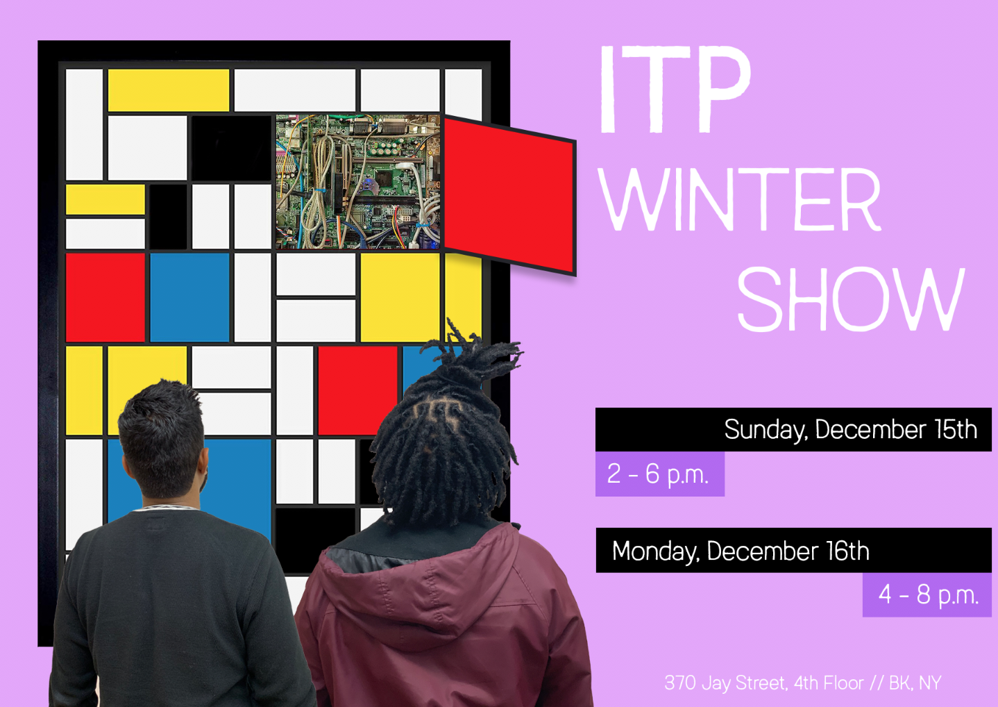
ITP is both an art and a technology program. It lives in the art school but has built a reputation for pushing the edge of creative technology. In my poster design for this semester’s Winter Show, I wanted to make sure that art was centered just as much as technology. In years past, posters have often highlighted emerging technologies like VR to get people curious about the show. I decided to highlight our connection to the art world with a reference to Mondrian— who helped push the art world towards a new, often uncomfortable, frontier of abstraction during his life.
Process
At the outset of designing this poster, I knew I wanted to take a well known work of art and create a visual effect of exposing the insides, revealing a “technological” guts underneath. I had to choose a painting, then choose the specifics of what tech linkage to make. Mondrian made sense— those familiar with his life and work could see that his aspirations were in some ways analogous to ITP’s: to develop new tools for expression that stretched and challenged broadly accepted norms. Moreover, the panels on this painting serve nicely for “opening up.”
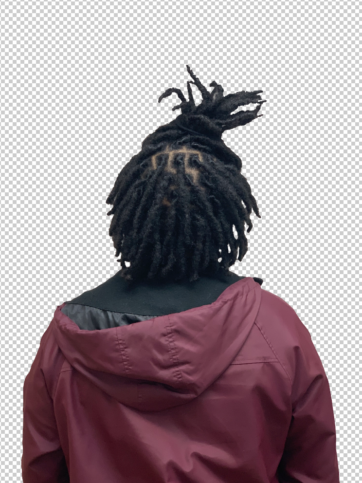
After landing on the concept, I quickly tested out whether it would look ok visually, especially since it was my first time using Photoshop seriously. I took a picture of my friend LeeLonn in the Motion Capture Lab space, then cropped out the background behind him (thanks Wen and Tina for the help!) Once I saw that it created a sense of depth and didn’t look too fake, I decided to add myself and then focus on the “tech” panel.
I tried a few different items in the panel, but landed on just using wires/circuits in one panel. It got the concept across most simply, without any distraction or risk of a stray panel being poorly edited or hard to see.
Next, I chose a typeface (Austral) after searching around the web for a while for something that communicated both the modernity and warmth of the ITP community, then I considered background color. I first thought about pulling in colors from the poster, but in this case, too much similarity didn’t end up working. I tried a light purple and a light green as well— the light purple looked nice, but washed out some of the text elements on the poster.
I also tested out a few different versions of the text blocks. Ultimately, I decided to go with the version at the top of the page because it created a symmetry with the Mondrian painting through its use of blocks and offset lines. The third element is bold in the version I chose and understated in the iteration above— I’m torn between the two, but I think the symmetry in the version I chose works better than the version above.
Finally, I also had a tough choice on margins. I chose to stretch the black margins all the way to the edge of the page to create a visual contrast to the margins elsewhere. To me, it looks intentional, but it teeters on the edge of looking sloppy. I’m not sure which is more effective between the poster I ultimately chose or the margins on this one below (disregard the collapsed purple tabs.)


