10 Years of Waves

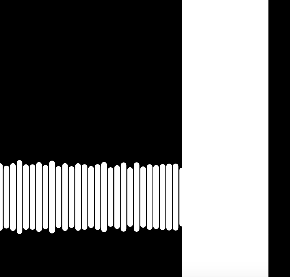
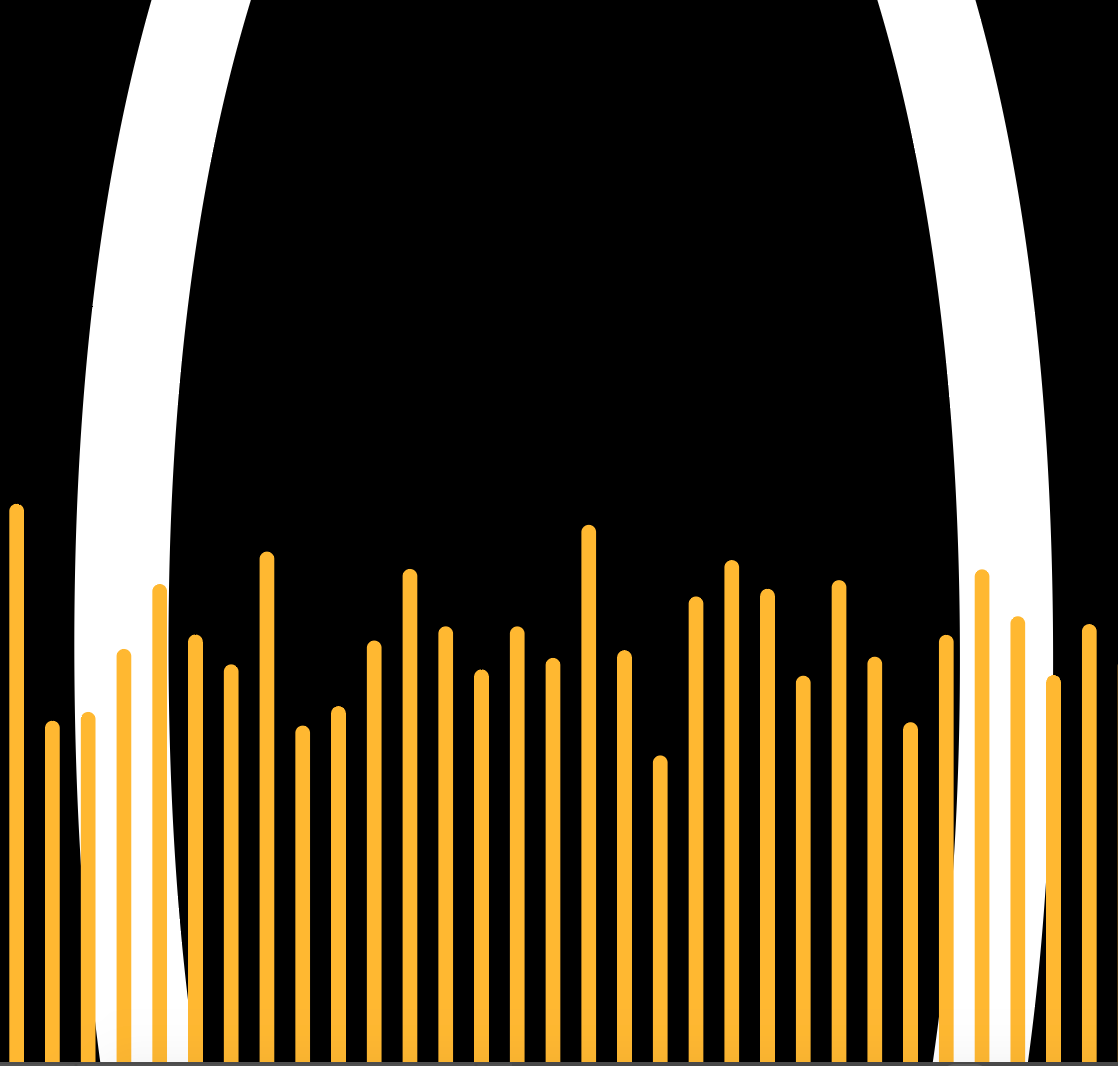
I recently found some music that I made in college, including the very first tracks I ever made. This academic year will mark 10 years since I graduated— it’s a good time to look back at who I was and who I’ve become. For this project, we were asked to use a color palette of 6 colors to represent ourselves and create compositions with just those colors. For the work below, I used the first 10 seconds of each of the 6 early songs that I found and visualized those as wave forms. I applied color to those waveforms and then placed them on a black canvas with white text of the number 10. I sized the waveforms differently and zoomed in close to the waveform to obscure the number 10 and create compositions that sometimes skewed each/any of the components of the image.

Below the gallery, I included the image of the full canvas. Note: when actually creating the compositions, I sometimes moved/deleted waveforms and the numbers, so what’s on this canvas now is not how it was set up for the compositions.

If you want to hear any of the tracks used for this piece (and maybe try to match the track to the composition), here is a private Soundcloud link.

10 master.png

Expressive Words

Last week in class, we focused on the form and function of typography. Our assignment was to choose 3 words and express them visually. A true test of whether I was effective with the assignment will be whether the words I visualized speak for themselves— so with that said, I’ll keep the writing brief.

I created each of these in Sketch, and spend some time just learning some functionality with modifying vectors in Sketch. I did not use animation for the assignment, but could use the other parameters of static illustration — things like color, shape, position, blur. A big part of this assignment (and dare I say a lot of visual design) plays on our biological tendency to make connections and associations between objects we view and meanings that we’ve stored in our brains. The images below communicate their meaning because of our associative brainpower; for example, rage = red, blur = the narrowing of our peripheral focus when enraged.

I said I’d keep it brief and let these words express themselves. So that’s all for now!

rage screen grab.png
jumble screen grab.png
chop grab.png

Graphical parks

Background

The National Parks speak for themselves, so long as you get a chance to visit. For the National Parks Service, then, the task of getting Americans and people from around the world to go to our 60+ national parks are one of their most important tasks. Today, the National Parks have a unified design system, the much heralded Unigrid System, that affords all of their materials a consistent style. But before the introduction of this design system in the 1970s, the NPS still produced beautiful work.

I chose to analyze a Yellowstone National Parks silkscreen print poster from the 1930s. A little background: coming out of the Great Depression, President Franklin Delano Roosevelt instituted a number of large public works projects across the US to both provide jobs (and paychecks, thus stimulus) to the large numbers of unemployed people, and to focus them on issues of national importance. One of those public works projects was the Federal Art Project, that stepped in to “spread the word” about the US National Parks after another public works project, the Civilian Conservation Corps completed preservation projects at the parks (read here for more background). I visited Yellowstone National Park and the Grand Tetons this summer and came back with a renewed sense of appreciation for the parks and the NPS who maintains that great treasure of ours.

160406-wpa-national-parks-posters-02.jpg

Grid System and Heirarchy

Even before the unigrid system formalized a design system across the NPS, this public works artist — who is still anonymous — adhered to a grid as well. As is apparent in the illustration below, all text occupies the top and bottom 20% of the poster, leaving the rest of the poster available for illustration. Old Faithful Geyser occupies the left half of the page, while the set of services provided by the park rangers lives in the right half of the page, forming a jigsaw-like contrast. The Parks logo is dead center, as is the center line of the “W” in Yellowstone. Even though this is a hand-drawn illustration, there is a very clean, organized aesthetic that accompanies the soft, organic feel of the rest of the poster due to the artist’s use of a grid system.

yellowstone poster grid.png

The grid serves to aid the composition and visual hierarchy of the poster. The big, blue skies of Yellowstone sweep across the page, while Old Faithful, the most popular attraction at the park, plays the starring role with its signature massive eruption. The dark contrast at the bottom of the page further reinforces the prominence of Old Faithful and allows the text to catch the eye second.

Remember, the poster is a part of a marketing campaign to help the American people both discover the National Parks and boost morale during a tough time. The poster very effectively captures the grandeur and simplicity of Yellowstone at once while passing along important information about the services offered by the US Federal Government - an important political objective for FDR.

Color

Part of the effectiveness of the poster is its color scheme. The colors gradually flow across a gradient from a dark stone blue at the base of Old Faithful to off-white steam spouting into the sky. The sky blue and text work well together— the text feels like it is cut out from the sky, just a transparency of the deeper blue. Text, lighter sky shading and shadowing for Old Faitfhul’s spout are all the same shade of blue, which lends a consistency and peacefulness to the illustration.

yellowstone colors.png

Typography

There is only one font used in the poster— Natura, which you can see below. The letter “A” is among the most distinctive letters in this generally stylized text, and focusing on the A shows how handmade this poster really is. Although the text is all the same font, it varies in size among the various headers and footers. However, as you can see in annotations 1, 2, and 3 as well as 4, 5, and 6, even when the letters are meant to be exactly the same, they vary a bit in width. In the age of digital printmaking, this sort of “error” would need to be intentional, otherwise it would likely not occur. In the 1930s era of analog (but still mass-produced) printmaking, this was unlikely to be intentional, but is nevertheless charming.

natura.png
yellowstone typefaces.png