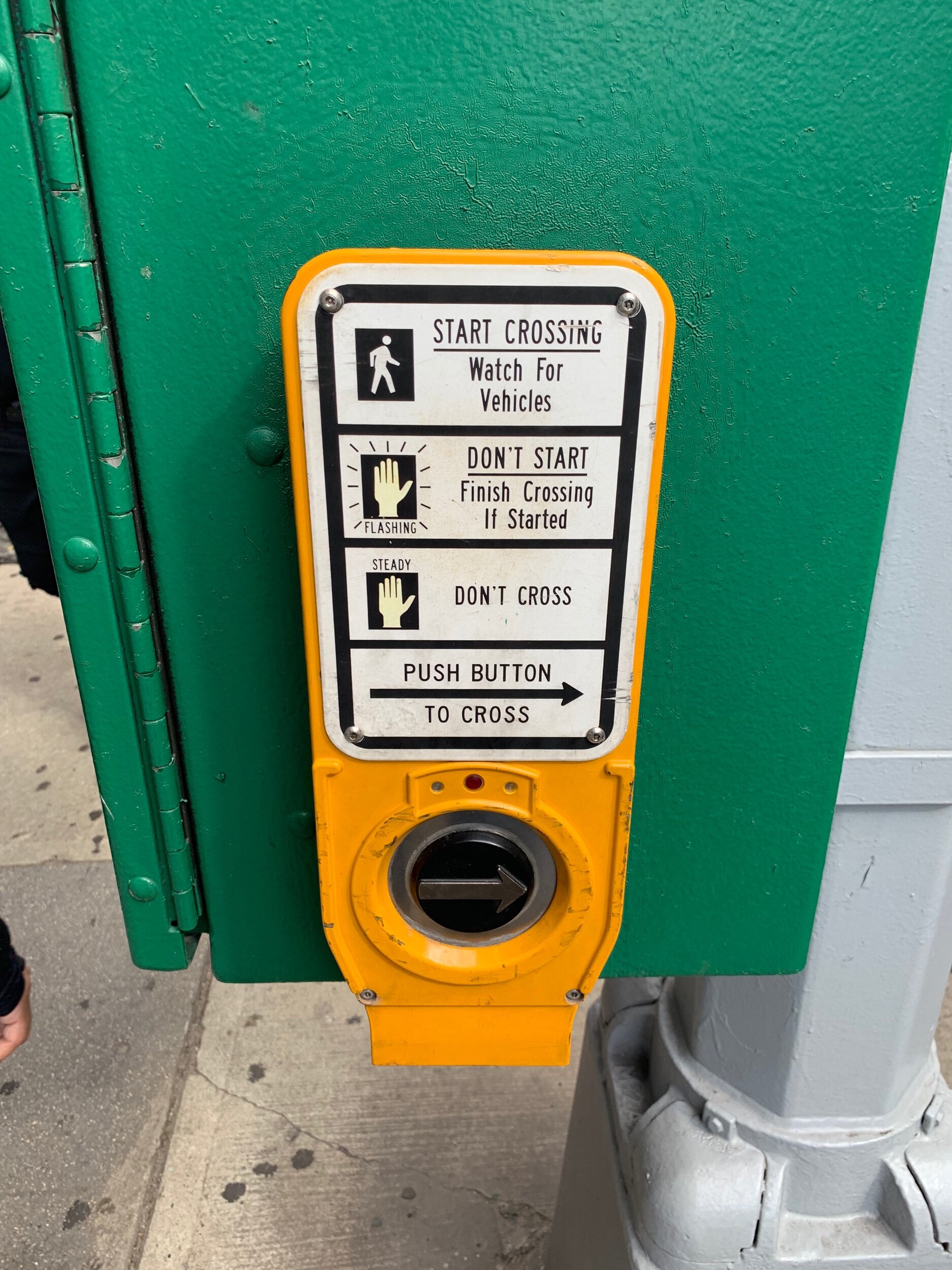
If you live in a city with crosswalks, you’ve probably seen something like this.
And if you’ve seen this button, you’ve probably wondered whether it actually does anything. The signage suggests that if a pedestrian presses the button, the walk sign will appear and traffic will stop. Of course, traffic doesn’t (and probably shouldn’t) revolve solely around the pedestrian, so the traffic cycle will play out before changing to walk. Often, even if the button is never pressed, the cycle will rotate through walk and don’t-walk signs with no human input. In most of these cases, it’s really difficult to know whether pushing the button has any effect on shortening the cycle. As a result, if you wait on the corner and watch people interact with this button, they will often either not push it at all despite needing to walk, or they’ll repeatedly push it, getting more and more annoyed that nothing is happening.
It’s possible that some of these systems are just placebos that make people feel in-control of the traffic cycle. It’s more likely that the system actually does work in some capacity, but doesn’t communicate what is happening in a satisfying manner. In it’s current state, this feels like a failed interaction, even if the system works as intended.
What could be improved? I’ll offer one suggestion for now. Let’s start by thinking about the different parts of this system:
1) Assume this is a simple intersection with 2 directions of car traffic, left turn lane protections for cars, and 2 directions of pedestrian traffic. There will be walk signs in both directions of traffic, along with stoplights for cars.
2) There is some traffic cadence e.g. 45 seconds for one direction of traffic, then 45 seconds for the other, with a 5 second pause in between.
3) This could be broken into two ranges: the minimum amount of time for traffic to flow before changing could be 30 seconds, and the maximum could be 1 minute.
In this setup, the default could be set to the maximum cadence time— traffic flows for a minute before switching directions. Pushing the button could set the cadence to its minimum of 30 seconds.
Right now, the frustration is generally due to the lack of feedback to the button-pusher. What if there was a simple countdown clock under the button that turns on after the button is pushed? Once the button is pushed, however much time is left on the traffic cadence cycle would be displayed on the countdown clock.
Perhaps this exists already— I have hazy memories of seeing better versions of these walk buttons outside of the US— but if not, I hope to see something like this soon! Even as cities switch to using motion detection for stoplights— having some simple feedback for pedestrians (and perhaps drivers) to understand what is happening under the hood generally will make for a more empathetic, less-frustrating experience.
