CollaboCoding in P5

Last week we began playing with variables, introduced conditional statements and for loops, and overall added more to our bag of tricks. Our homework asked us to use some of these tools to create buttons or sliders that controlled some other element on the screen (without using buttons that we get for free from the browser or bootstrap-like tools.)

But really, this week was about learning how to make our code organized and commented well enough for another human to understand. So, I’ll reflect a bit about what worked and didn’t work so well while collaborating with a partner.

Our Approach

We decided to start our sketches individually rather than agreeing on a design before we’d had time to process the week’s lessons. Each of us took a couple of days to mock up a sketch of our own, then traded over the weekend to review and add to our partners’ sketch. On Monday/Tuesday before class, we chatted about our changes in-person and helped each other understand our additions or changes to each others’ code.

Drafts

In my initial draft, my intent was to create a set of buttons that mapped to the basic parts of a sentence — subject, verb, adjective, noun — and changed each of those corresponding parts of a sentence with each button press. In order to do this, I knew I’d need to work with an array of strings and use some logic to randomly select from those arrays, then call the results of that logic in the rest of my code. I also knew that I’d need to use the mousePressed() or mouseClicked() functions with conditionals that mapped to each rectangular button.

As I began to figure out the word choice logic, I created variables with different pieces of the process; one variable to create a list of words, another to randomly select an index from that list, another to translate and store that index as an actual word. When I needed to wire that up to buttons, however, I realized that I’d either need— or drastically improve the efficiency of my code— with a function specifically for all of this logic. This took me away from animation, but ultimately was a rewarding process!

My partner created this very cool looking animation. Her goal was to have the background change to the roll-over color of each circle when pressed. However, there was initially some odd behavior that kept the background blue under certain conditions. I made it my goal to debug this issue and get her sketch working as she intended.

Collaboration

Once I got the code in my sketch working the way I wanted it to in a simple, very lightly styled interface, I focused on writing comments that would make the code immediately understandable for my partner, without needing to physically explain anything. For the most part, it worked— my partner was able to add a ton of animation and styling to the next iteration of the sketch. However, I failed to make clear why I created a “quarterW” and “quarterH” variable, so she ended up writing her on logic for rectangle sizing using the built-in width and height variables.

When we met face-to-face to talk through our results, we discovered an unintended behavior of the “frame” in her additions to my sketch, which we were able to debug together. While our comments helped us get 90% of the way, it was helpful to debug together. We were also able to discuss the changes to her sketch that debugged her initial vision (here). The solution was fairly straightforward to implement: at the very end of the code, the part that created toggles for on1, on2, and on3, we needed to ensure that if one button was on, the other 2 were off. By showing her how console logging the states of each “on” variable allowed me to see the unintended behavior in her initial sketch when multiple variables were on at the same time, we were able to quickly understand the roots of the bug.

Overall, the most useful part of this exercise was having to pay close attention to how our code was organized and commented, which will continue to be important as we start adding more and more to our toolkit!

Shoutout to Beste Saylar, my heretofore anonymous partner :)

For clarity: NK Draft, Beste revision // Beste Draft, NK revision
PComp Interaction Fail IRL

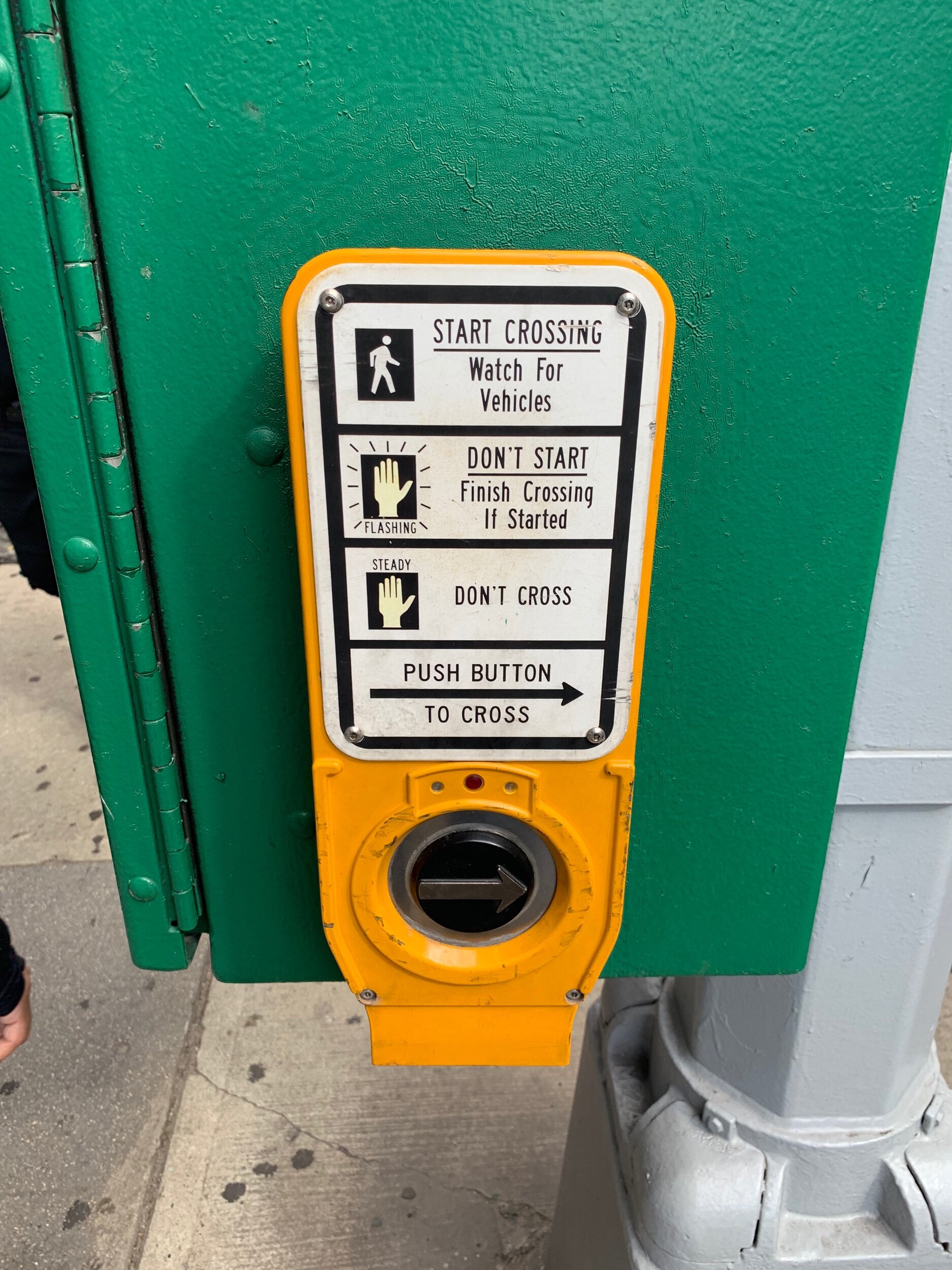
If you live in a city with crosswalks, you’ve probably seen something like this.

public.jpeg

And if you’ve seen this button, you’ve probably wondered whether it actually does anything. The signage suggests that if a pedestrian presses the button, the walk sign will appear and traffic will stop. Of course, traffic doesn’t (and probably shouldn’t) revolve solely around the pedestrian, so the traffic cycle will play out before changing to walk. Often, even if the button is never pressed, the cycle will rotate through walk and don’t-walk signs with no human input. In most of these cases, it’s really difficult to know whether pushing the button has any effect on shortening the cycle. As a result, if you wait on the corner and watch people interact with this button, they will often either not push it at all despite needing to walk, or they’ll repeatedly push it, getting more and more annoyed that nothing is happening.

It’s possible that some of these systems are just placebos that make people feel in-control of the traffic cycle. It’s more likely that the system actually does work in some capacity, but doesn’t communicate what is happening in a satisfying manner. In it’s current state, this feels like a failed interaction, even if the system works as intended.

What could be improved? I’ll offer one suggestion for now. Let’s start by thinking about the different parts of this system:

1) Assume this is a simple intersection with 2 directions of car traffic, left turn lane protections for cars, and 2 directions of pedestrian traffic. There will be walk signs in both directions of traffic, along with stoplights for cars.

2) There is some traffic cadence e.g. 45 seconds for one direction of traffic, then 45 seconds for the other, with a 5 second pause in between.

3) This could be broken into two ranges: the minimum amount of time for traffic to flow before changing could be 30 seconds, and the maximum could be 1 minute.

In this setup, the default could be set to the maximum cadence time— traffic flows for a minute before switching directions. Pushing the button could set the cadence to its minimum of 30 seconds.

Right now, the frustration is generally due to the lack of feedback to the button-pusher. What if there was a simple countdown clock under the button that turns on after the button is pushed? Once the button is pushed, however much time is left on the traffic cadence cycle would be displayed on the countdown clock.

Perhaps this exists already— I have hazy memories of seeing better versions of these walk buttons outside of the US— but if not, I hope to see something like this soon! Even as cities switch to using motion detection for stoplights— having some simple feedback for pedestrians (and perhaps drivers) to understand what is happening under the hood generally will make for a more empathetic, less-frustrating experience.

Expressive Words

Last week in class, we focused on the form and function of typography. Our assignment was to choose 3 words and express them visually. A true test of whether I was effective with the assignment will be whether the words I visualized speak for themselves— so with that said, I’ll keep the writing brief.

I created each of these in Sketch, and spend some time just learning some functionality with modifying vectors in Sketch. I did not use animation for the assignment, but could use the other parameters of static illustration — things like color, shape, position, blur. A big part of this assignment (and dare I say a lot of visual design) plays on our biological tendency to make connections and associations between objects we view and meanings that we’ve stored in our brains. The images below communicate their meaning because of our associative brainpower; for example, rage = red, blur = the narrowing of our peripheral focus when enraged.

I said I’d keep it brief and let these words express themselves. So that’s all for now!

rage screen grab.png
jumble screen grab.png
chop grab.png

Make 5 and Philosophy

First, the assignment, and then, the weirdness.

This week in Intro to Fab, we were asked to make 5 of something using more than 1 technique for the repeated item. The goal was to think about repeatable processes— things like clamp setups and jigs, among others.

I made 5 rings for a “Tower of Hanoi” game.

They’re different sizes, but all used the hole saw attachment on the drill press. I mistakenly did not attach the center hole drill bit, so I also had to set up a system for drilling holes in the center of each ring. Afterwards, I sanded each of the pieces, first a bit on the belt sander, then manually. Finally, I coated each of the rings in black paint then drew a character across them (pictured later.)

public.jpeg

I didn’t quite succeed in the core purpose of this assignment. I don’t think the processes I used were as thoughtful and repeatable as they could have been. In the crush of the week, I think I ended up locking in to a concept rather than really focusing on the intent of the assignment. I could have more thoughtfully rigged up a system for precisely sanding the rings, drilling holes and even cutting/sanding the corners on the game board.

With that said, I did end up using all of the equipment in the shop and even made it out to Reuse to pick up wood. And in the process of making my assignment, I rediscovered a line of philosophy that I really enjoyed way back in the day in undergrad, a good 12-13 years ago!

public.jpeg

The Game

As a little kid, we had a couple of wooden tabletop games that I vividly remember. One of them was a game that I now know is modeled after the Tower of Hanoi mathematical puzzle. The goal is to move all of the rings in the tower from their starting dowel to another one, one ring at a time, with the bigger rings never on top of smaller ones.

The goal is to do it in as few moves as possible— which, spoiler alert, winds up being 2^n -1 where n is the number of rings on the board.

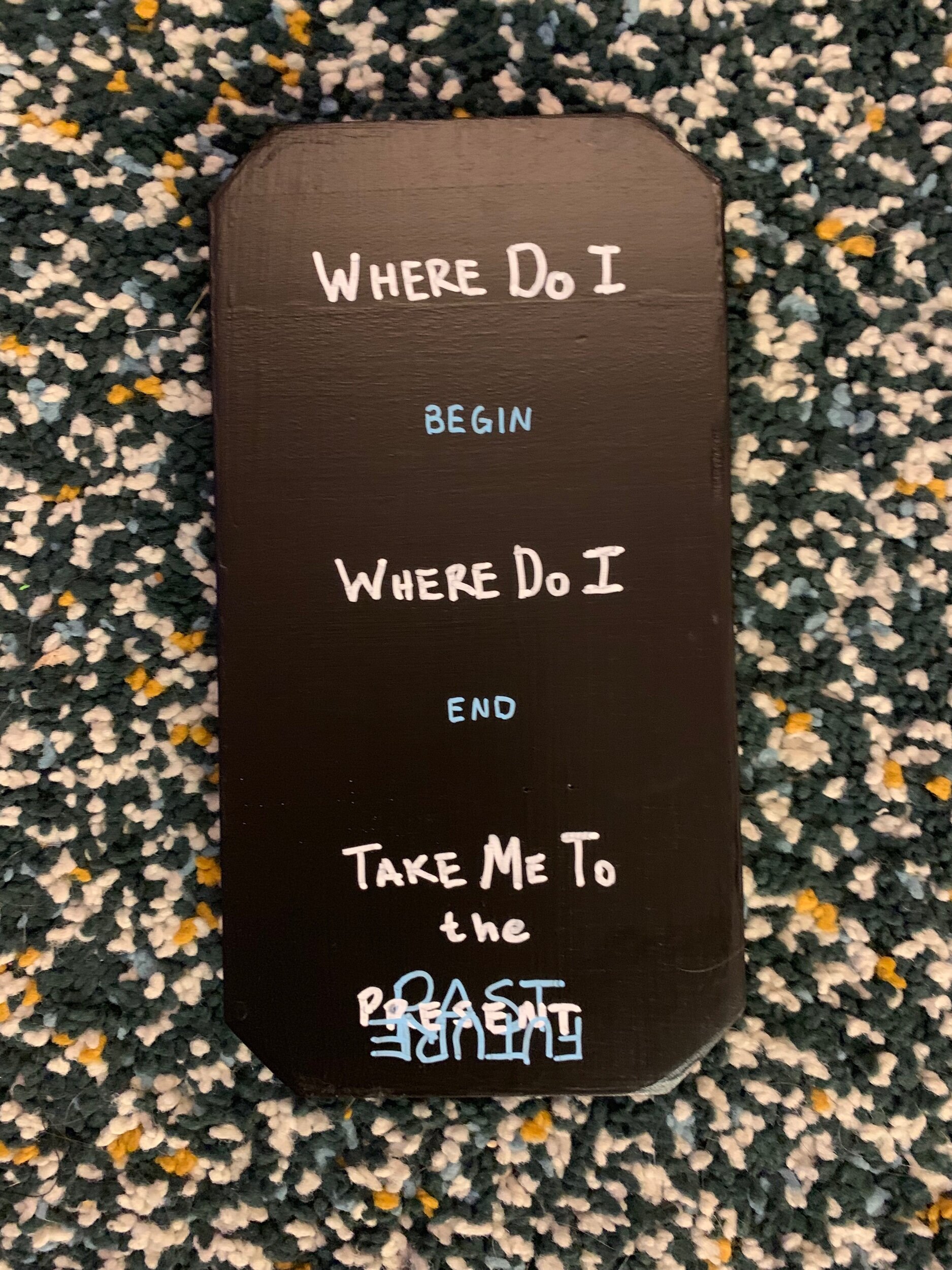
I added an additional component — reconstruct the character on the rings as well.

The inspiration

What’s the deal with the character and board decorations?

It starts with a line of philosophy focused around the “continuity of consciousness” — in other words, how do we define what a mind and/or a body is *over time.* I remember discussing this during Philosophy 101 back in undergrad as part of a broader unit on the theory of mind, free will and simulations.

First, a couple of thought experiments (for a more expansive set of thought experiments, this blog post is solid.) For each of these, think: in which case is your mind and/or body continuous throughout the whole scenario:

1) You enter a teleportation device and immediately are sent to another location

2) You enter a teleportation device, then a month later, you appear in another location.

3) You enter enter a teleportation device which sends you to another location one atom at a time.

I’ll let you ruminate on the answers. Maybe I’ll share some thoughts on my answers in a later post or addition to this one. But for now, let’s just leave it as a thought experiment that inspired the drawings on the game. The character in the game is in scenario 3, being sent one piece at a time to another part of the board — the past, present or future.

public.jpeg

Hit The Switch

This week’s PComp assignment— somehow our very first— was to make a switch. That’s it— make a switch. Last week in fabrication, I learned the simple mechanical function of a switch in a circuit when I made my pickle flashlight with a traditional on/off pushbutton switch. This week, we were encouraged to get a little more creative. Behold, the latest addition to our collection of things we can procrastinate with later in the semester:

Inspiration

With so many of our interactions limited to touching and swiping, are we losing out on a wider range of potential human expression through interaction? Our discussions in class have been fascinating, and I loved that it naturally led into this assignment. I wanted to use some human action that felt different than touch, and as I was watching some basketball highlights, I thought I’d prototype a throwing-based switch.

Prototype and Process

In my kitchen, I repurposed the circuit from my pickle flashlight, grabbed a solo cup and a piece of crumpled foil out of the recycling bin and gave it a shot… (no pun intended, seriously):

The switch worked! Now for the easy stuff… right? Let’s list out what was left to do:

  • Extend/lengthen the wire setup for a fully conceived design.

  • Make the surface area for the wire contact points as wide as possible to ensure the ball would turn on the light.

  • Solder the wires to the light sources and to the additional contact material to keep them secured, in-contact and not moving around.

  • Secure the cup too— the cup fell over when the foil ball hit the rim.

  • Make everything look better!

With these high-level areas of focus in-hand, I went to work on each part. I started by deciding, while picking up wood for fabrication, that I’d make a little basketball court with a backboard.

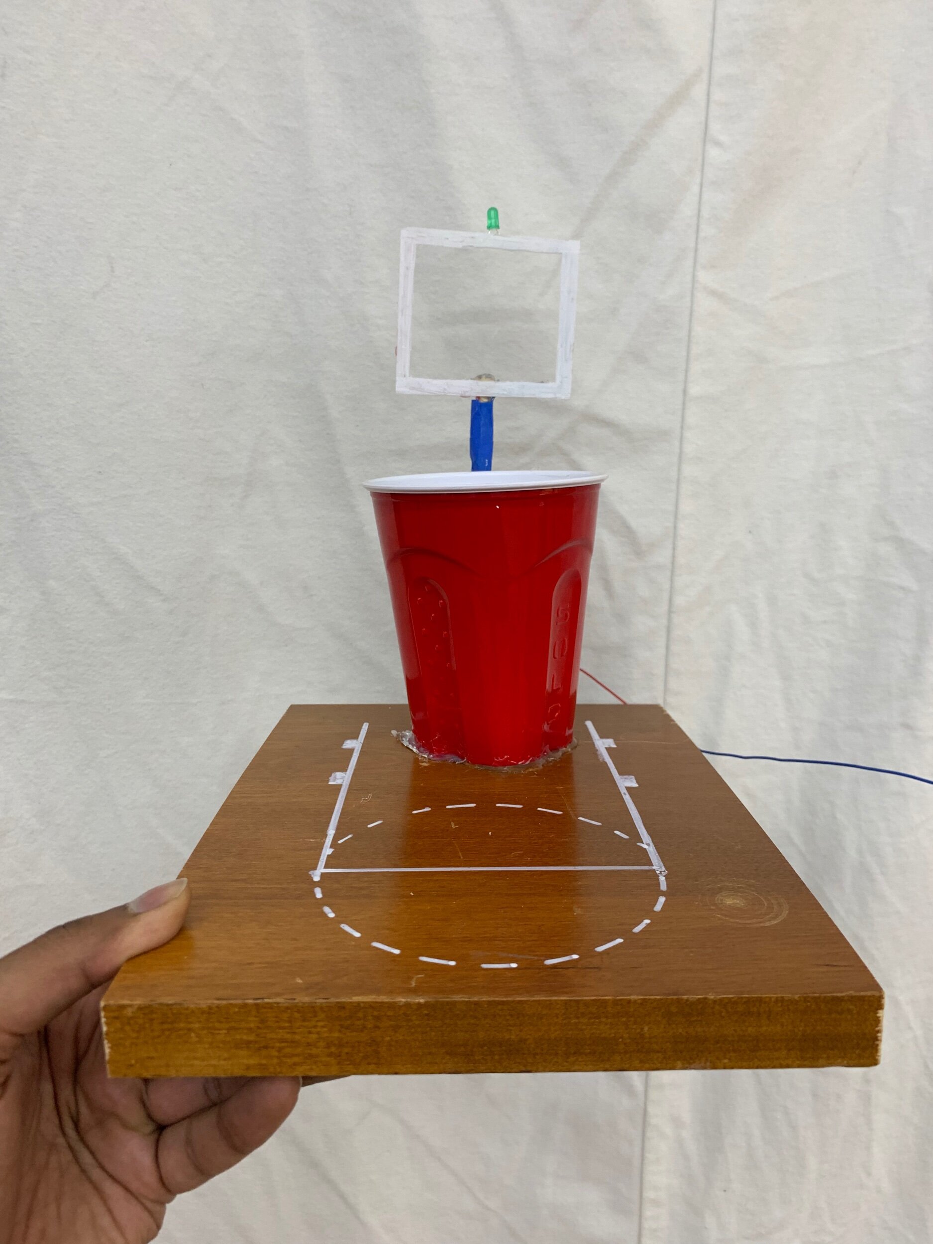
Instead of a hoop/net, I decided to keep the red solo cup with its bottom cut out— either to make sure that the ball didn’t roll off the court and off the contact points, or out of subconscious college beer pong flashbacks. I cut a piece of wood, painted a free throw line, and grabbed a piece of acrylic from the free bin for the backboard. To complete the court, I borrowed a wooden dowel from Jake, drilled a small hole in the wood, and stuck in the dowel for the goal post. I glued the wires along the perimeter of the backboard behind white paint and taped them onto the goal post with blue tape (a-la- the foam padding on real goal posts) to hide away the wiring as much as possible.

In case it’s not visible, I put two pieces of foil on the court inside the solo cup with a narrow sliver of space in between them. I connected one of them to the positive wire connected to the light and the other to another piece of positive wire leading back to the power source. The ground wire was attached to the negative pole of the light. After hitting a shot into the cup, the piece of foil completed the circuit by connecting the two pieces of foil (and the positive part circuit wire.)

I tested the circuit to make sure it worked along the way. Along the way, it turned out that I needed a few soldering jobs to make sure everything worked according to plan. More on that below!

Help! I need somebody

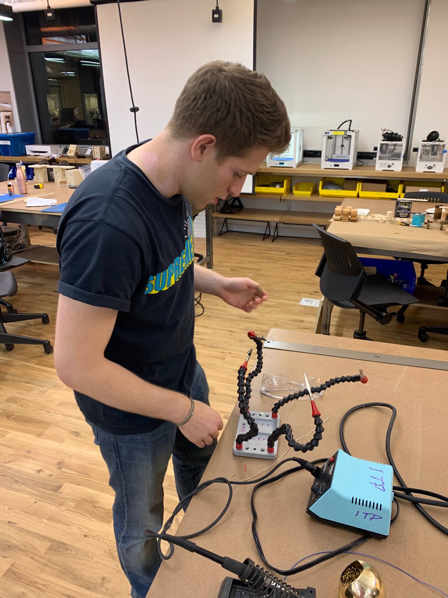
I haven’t studied circuits since 2005. Given the rapid pace of our classes, getting up to speed is a team effort. Special thanks to Ben, Noah and Helen for helping me learn how to solder — never done it before! — and Cy for ideas for improving the connectivity of my circuit + taking pics. Shoutout to Emily and Jake for videos as well!

Thanks to everyone above for all the help! Noah pictured here teaching me how to solder. (Ben and Helen not pictured)

Thanks to everyone above for all the help! Noah pictured here teaching me how to solder. (Ben and Helen not pictured)

Final product for PComp Week 2 Switch assignment

Final product for PComp Week 2 Switch assignment

Variables!

Last week, I drew a sketch of a hiker climbing some mountains (vaguely resembling the Grand Tetons) around sunset. As the very first exercise with p5js, we were encouraged to keep everything hard-coded to get a better feel for how different value ranges would express themselves on the screen.

This week, however, we’re having fun with variables!

So- I took last week’s drawing and made it more interactive (click link here to see).

Just like what I imagine so many assignments will be like at ITP, there are a number of elements of this sketch that I would like to do differently, if I had some more time. Here are a few examples:

1) Switch which components the mouse controls

When I initially started the assignment, I knew how to move the sun and sunset color slices, but didn’t yet figure out how to move the hiker— which is really a collection of lines, rather than a single function like fill() or ellipse(). Fill() and ellipse() are easier to parameterize with variables. I wound up using translate() for the hiker after I’d already coded the interactivity with the sun and background. I knew I wanted some elements to move based on time and others to move with mouse interaction. The sun/background moving with time and hiker moving with user control would have made more sense… but this is art school, so let’s just say I meant this as an attempt to invert our relationship with time and the sun. To give the user control over one of the things normally entirely out of our control: time… or something like that :)

2) Make the hiker descend upon hitting the window width + reflect around the y-axis

Currently, the hiker glides backwards down the mountain a good handful of seconds after getting to the width of the window. I couldn’t see immediately why my incrementing structure doesn’t work; with a few more minutes (or hours) I think I can figure this out, but alas, I don’t have them right now. Console.log-ging the x variable shows that the x variable reaches ~430 when the figure appears to leave the window frame, reaches 600 (the current window width) a few seconds later, then starts the descent. The y-variable logs as a negative number the entire time, even though the incrementing function should only reverse the sign when x > width or x <0.

From an aesthetic perspective, it looks strange to see the hiker walk down the mountain backwards. I’d like to have it flip across its y-axis when it turns around, but I’m not quite sure how to do so yet.

While the sketch isn’t perfect, it has definitely given me clear questions that I’d like to learn the answer to. Perhaps the next topics will lead to some more efficient and effective approaches.

On to For loops!

Graphical parks

Background

The National Parks speak for themselves, so long as you get a chance to visit. For the National Parks Service, then, the task of getting Americans and people from around the world to go to our 60+ national parks are one of their most important tasks. Today, the National Parks have a unified design system, the much heralded Unigrid System, that affords all of their materials a consistent style. But before the introduction of this design system in the 1970s, the NPS still produced beautiful work.

I chose to analyze a Yellowstone National Parks silkscreen print poster from the 1930s. A little background: coming out of the Great Depression, President Franklin Delano Roosevelt instituted a number of large public works projects across the US to both provide jobs (and paychecks, thus stimulus) to the large numbers of unemployed people, and to focus them on issues of national importance. One of those public works projects was the Federal Art Project, that stepped in to “spread the word” about the US National Parks after another public works project, the Civilian Conservation Corps completed preservation projects at the parks (read here for more background). I visited Yellowstone National Park and the Grand Tetons this summer and came back with a renewed sense of appreciation for the parks and the NPS who maintains that great treasure of ours.

160406-wpa-national-parks-posters-02.jpg

Grid System and Heirarchy

Even before the unigrid system formalized a design system across the NPS, this public works artist — who is still anonymous — adhered to a grid as well. As is apparent in the illustration below, all text occupies the top and bottom 20% of the poster, leaving the rest of the poster available for illustration. Old Faithful Geyser occupies the left half of the page, while the set of services provided by the park rangers lives in the right half of the page, forming a jigsaw-like contrast. The Parks logo is dead center, as is the center line of the “W” in Yellowstone. Even though this is a hand-drawn illustration, there is a very clean, organized aesthetic that accompanies the soft, organic feel of the rest of the poster due to the artist’s use of a grid system.

yellowstone poster grid.png

The grid serves to aid the composition and visual hierarchy of the poster. The big, blue skies of Yellowstone sweep across the page, while Old Faithful, the most popular attraction at the park, plays the starring role with its signature massive eruption. The dark contrast at the bottom of the page further reinforces the prominence of Old Faithful and allows the text to catch the eye second.

Remember, the poster is a part of a marketing campaign to help the American people both discover the National Parks and boost morale during a tough time. The poster very effectively captures the grandeur and simplicity of Yellowstone at once while passing along important information about the services offered by the US Federal Government - an important political objective for FDR.

Color

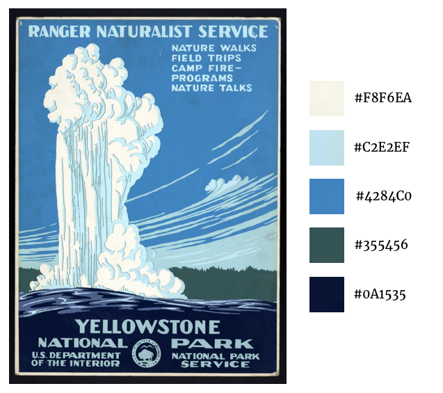
Part of the effectiveness of the poster is its color scheme. The colors gradually flow across a gradient from a dark stone blue at the base of Old Faithful to off-white steam spouting into the sky. The sky blue and text work well together— the text feels like it is cut out from the sky, just a transparency of the deeper blue. Text, lighter sky shading and shadowing for Old Faitfhul’s spout are all the same shade of blue, which lends a consistency and peacefulness to the illustration.

yellowstone colors.png

Typography

There is only one font used in the poster— Natura, which you can see below. The letter “A” is among the most distinctive letters in this generally stylized text, and focusing on the A shows how handmade this poster really is. Although the text is all the same font, it varies in size among the various headers and footers. However, as you can see in annotations 1, 2, and 3 as well as 4, 5, and 6, even when the letters are meant to be exactly the same, they vary a bit in width. In the age of digital printmaking, this sort of “error” would need to be intentional, otherwise it would likely not occur. In the 1930s era of analog (but still mass-produced) printmaking, this was unlikely to be intentional, but is nevertheless charming.

natura.png
yellowstone typefaces.png

PowerPickle

Ever wonder why you can’t just take a cucumber with you on a hike and use it to light up your path after it gets dark?

No?

Is it because cucumbers don’t light up?

If that’s the only reason you didn’t ever have this thought before, you’re in luck! Introducing, the PowerPickle:

Ok, yeah, the casing needs some work and yeah, that green light probably won’t light up much, and yeah, once you take a bite of your cucumber, the circuits will fall out and yeah, it’s going to dry up and maybe rot pretty quickly. But… let’s not dwell on the negatives, let’s talk about how this got built!

I knew what I wanted to make: a vegetable (any kind) that had a switch to turn it on and shine some light out of the top. Beyond that, all I knew is that I needed a battery, some wires, a lightbulb, and some kind of switch to embed into the vegetable. I looked up “electronics store” on Google Maps and saw that the Tinkersphere was nearby. Walking in, I knew that this place would probably become a regular visit. Good thing it’s right next to one of my favorite ramen places, https://mrtakaramen.webs.com/.

public.jpeg

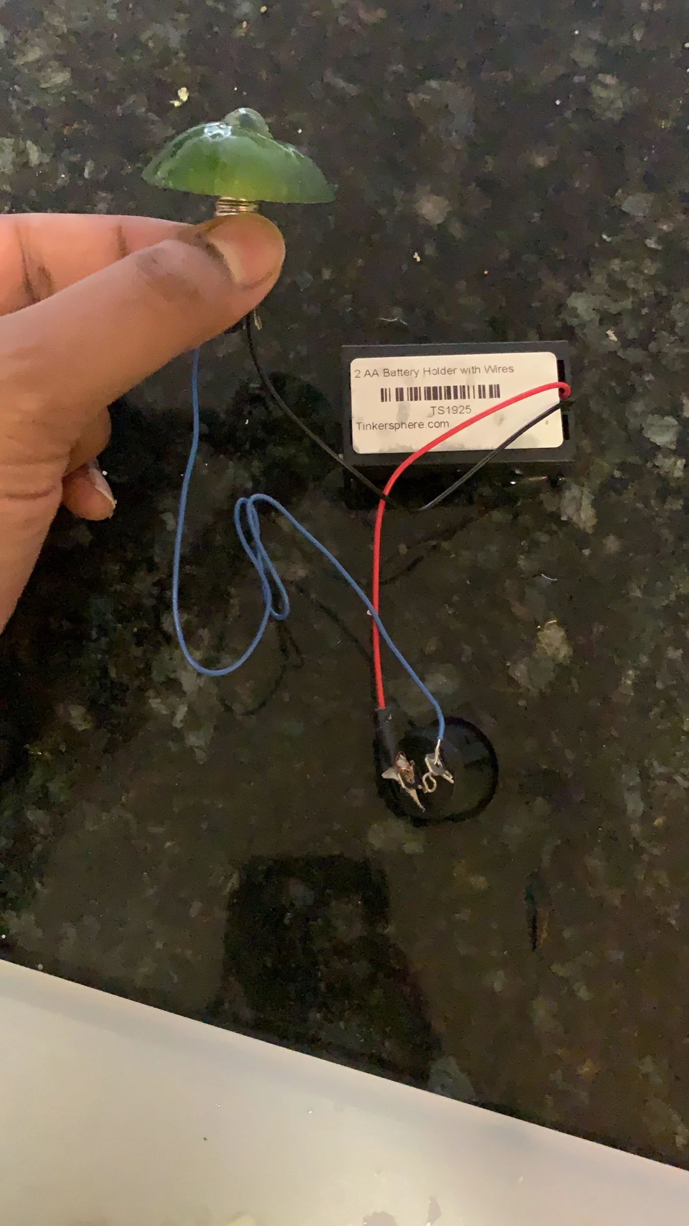
Once I got the parts, I headed into the ITP studio and set up my circuit. I didn’t initially realize that a switch just conveyed positive charge, so I spent a few cycles sending smoke into the air while essentially shorting the circuit. After some googling, however, I realized how simple this circuit is.

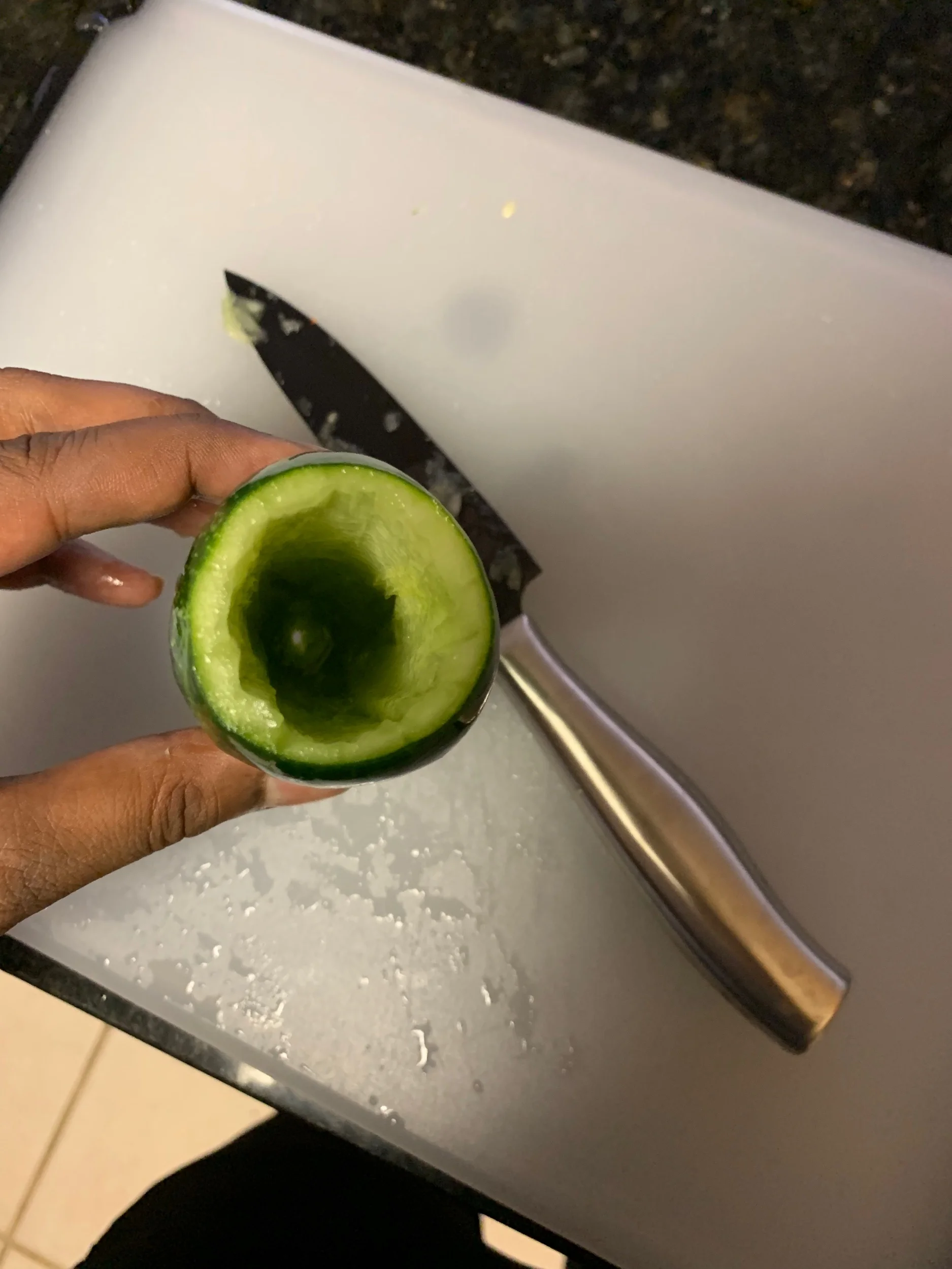
I got the light to turn on with just the batteries and switch. Then, I went to Whole Foods, bought a few kinds of cucumbers and zucchinis of different sizes— both vegetables that would be big enough to hold the electronics and easy enough to hollow. When I got home, I started carving the cucumber.

public.jpeg
public.jpeg

The circuit stopped working when I initially put it inside the cucumber. After a little testing, it became clear that the problem was with the contacts— I needed my wiring to more solidly and consistently make contact with the lightbulb, switch and batteries. I taped everything up, which did the trick. Then, I crammed the circuit into the cucumber— in the future, this could have been done a bit more elegantly as well, probably with just a bit of tape. This time around, I just wanted to get the PowerPickle to work!

public.jpeg

It did work, although the enclosure for the switch started to widen as I fiddled with it. At the end of this experiment, I tried using toothpicks to fasten the top of the cucumber/head of the flashlight back to the body, which sort of worked, but would probably loosen quickly. Another area to improve upon.

Author’s note: I cut my fingernails immediately after seeing the picture above^

Creating a Static Drawing in p5js

Assignment Prompt: Create your own screen drawing: self-portrait, alien, monster, etc. Use 2D primitive shapes – arc(), curve(), ellipse(), line(), point(), quad(), rect(), triangle() – and basic color functions – background(), colorMode(), fill(), noFill(), noStroke(), stroke(). Remember to use createCanvas() to specify the dimensions of your window and wrap all of your code inside a setup() function

I started this assignment by reflecting about what I’d like to draw. Like so many assignments at ITP, from this early perspective at least, we had a lot of agency to take this in any direction. I recently came back from a trip to the Grand Tetons and Yellowstone National Park, so images of the outdoors are still fresh in my mind. After doing some research into the National Parks’ design system for Visual Language, I decided to make my own outdoor drawing.

public.jpeg

I’m not very experienced in drawing, but regardless, with the assignment in mind I tried to keep the shaped in my sketch to those that I knew were possible with 2D primitives in p5. Part of my goal with the assignment was to familiarize myself with the basic drawing functions, including curves, before we moved on to more advanced concepts.

Along the way, my final image transformed. I started with a blue background and bright green grass— a sunny day, with trees and a river taking center stage. But when I looked at my screen after being away for a while, the brightness was a little jarring, and the river just didn’t look right. I tried varying the background to look more like a sunset— that looked better!

Then I started to move the sun around until it look natural. Behind the mountains or fully visible? Closer to the red part of the sunset or higher up? This was not a very scientific process— I looked at a couple sunset pictures but ultimately just went with my intuition.

After getting rid of the rivers (and my use of the curve function,) the screen looked a little too barren.

“Well, the assignment did mention a self-protrait as inspiration… How about I add a stick figure backpacker?”

This did the trick— now the image has a little more movement and a central character. I added some stars to the night sky emerging as the sun fades away.

The final image captured a little taste of the magic that I remember of the Tetons in the evening.

Image of a stick figure hiker hiking up a hill with mountains in the background, a sun fading, and a multi-color sky with stars starting to emerge.

To see the code for this image, go to this link: https://editor.p5js.org/nkumar23/sketches/JujD9a_vr

OK Computing

As a general rule, when I consume a lot of something, I want to know how to make that thing to some baseline level of competence. Whether it’s food, music, literature or film, this principle has generally held. So much of my recent life has been connected to computing, computers, software, and the software industry-- and although I’ve started learning to code a number of times without really going all-in, I’ve never forced myself to sink or swim on a coding project. It’s time to change that.

I’m excited to make progress in ICM towards knowing how to code beyond a conceptual level. I’m excited to make mistakes and debug even when I want to stop. I’m excited to write functions, learn some of the weirdness of JavaScript-- and hopefully to be confident with my ability to learn more complex concepts and languages after this semester ends.

As someone who’s sat on the “non-technical” side of software companies, often in roles that hybridized design, product and business development, I’ve had to learn how to work with engineers and explain technical concepts without actually building them. After ITP, maybe even after this course, I’ll want to cross the line into the “technical.”

But I could have gone to a bootcamp if that’s all I wanted. Being at ITP means that I’ll have the space to wield code as another medium among many. In this course, I want to use code in conjunction with music, video, data and/or text. I want to keep my mind open to the specific projects I might undertake, but regardless of what I do, I’d like to make use of the freedom to be weird and explore the non-practical while outside the confines of the workplace. 

I love making music. I love teaching. I love cooking. I’m a fan of music videos, animations, and informative, playful uses of data. Maybe some of these will come together with code this semester. But with each day, as we have stimulating conversations and rapidly add new skills and perspectives, I’m just as excited about creating something I wouldn’t have expected from my September 10, 2019 perspective as I am about anything I’m walking in the door with. Let’s go!