Sample Bank for Video Performance

Assignment: Use a cell phone to record 5 - 10 minutes of short clips, meant for future use as a sample bank for video performance.

Process: I really enjoy making sample-based music. When looking for audio samples, I often listen for a number of variables— the texture and color of the sound, the harmonic motion in the clip, the content of the sample (whether the literal spoken words or musical meaning). When shifting to finding video samples, a lot of the same qualities from sound are worth considering in video. Just as audio can be manipulated or refined, chopped up and stripped down, video can be too. So, I approached this assignment similarly to how I would capture audio snippets.

I didn’t go out of my way to visit any places in particular; instead I noticed moments in my daily life worth capturing. There are so many possibilities every day! I had an increased attentiveness to my surrounding— at least in spurts— which was a nice side effect of this assignment :P In the first set of clips that I recorded, I had some stable part of the composition and some motion. The clip below is a good example: the trash can and buildings are stable (or at least should have been if my hand weren’t shaking), the scarf is blowing a bit with the wind, and the out-of-focus cars are moving even more. I picked this clip for this motion/stability juxtaposition, but also because I thought the message on the can could be useful in the right context.

This next clip also used this stability/motion contrast but also was just super mesmerizing. I went to an over-the-top lighting store near my house and was totally captivated by all of the crazy fixtures everywhere. This one stood out— it reminds me of the movie Samsara.

I love watching basketball, and I had games on in the background at home quite a bit last week. I shot a few different clips while playing around with my distance/angle to the screen. A friend painted a mural on the wall in my living room, and when the angle is right, the mural reflects off of the tv screen and creates an interesting translucent effect. I’m still trying to get the best shot of this — it does better when the court is painted a darker color — but you can see some of what I’m going for in this clip.

Continuing with the basketball game/TV screen — I captured a little clip of my favorite player, James Harden, but at super close range to the TV. There’s a ton of color, rhythmic motion, and a recognizable face. I could probably use this clip in a lot of ways beyond the obvious of literally referencing Harden (although I very well might do that :)) I took some other shots at super close range that ended up showing the lines/pixelation in the actual screen. Kinda cool, maybe useful, not uploaded here.

I was absent-minded and recorded a bunch of clips in vertical mode. In case I end up doing any performances that need this format, I do have a bunch of material available! I really like this disco ball and its light refraction from 169 Bar.
Random Dancer

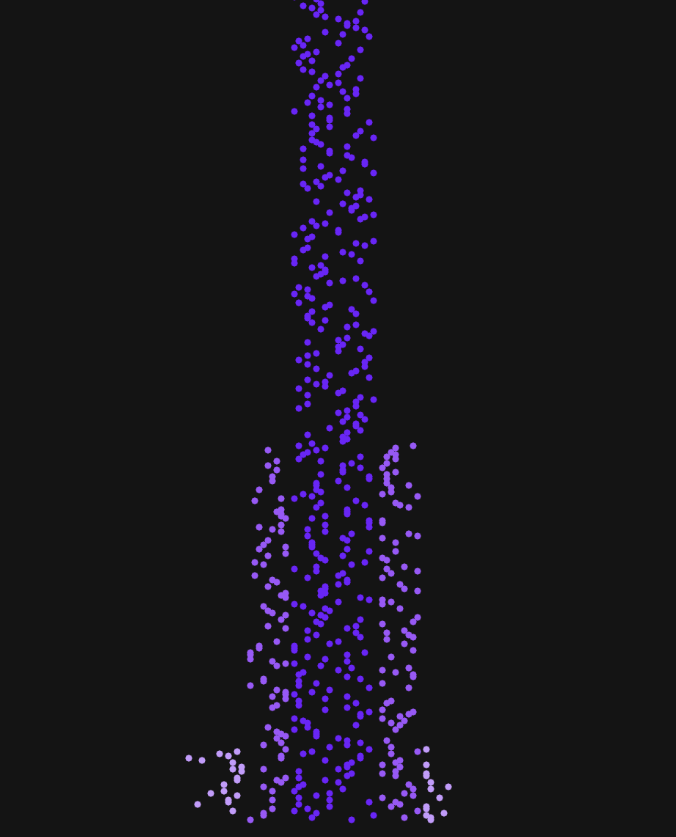
Assignment: Using the random walker as a model, develop a program that experiments with motion. 

Code Example from Pic 1: Gaussian Distribution

Code Example from Pic 2: Gaussian Walker

Process:

I set out this week to explore probability distributions in the context of random walkers. My hope was to create a visualization that allowed participants (not saying users!) to select between a number of real life scenarios that followed common probability distributions (normal, binomial, logarithmic, etc); those probability distributions would inform the behavior of the walker.

Alas, the first week of school and the crazy waitinglist game (and the homework that comes with being in so many classes at once) derailed my ambition. Instead, I learned about how to implement the randomGaussian() function and watched videos about custom probability distributions.

I began by trying to drawing a normal distribution. I managed to get something working here. This isn’t quite a histogram; instead I tied the y position of the ellipse to the conditional statement related to each band of the probability distribution. As a result, this drawing will keep going beyond the canvas, and as a result, after a while the proportions between each band of the distribution become unclear. It’s not the most accurate/efficient implementation, but it confirmed that I was using the Gaussian function correctly.
Screen Shot 2020-02-03 at 11.48.43 PM.png

Next, I brought the randomGaussian() function back into the random walker example to inform the step behavior of the walker. Initially, I gave each band of the distribution a different color and different sized step, which made a marginally more interesting version of the Levy flight example presented in course materials. I played with different parameters — fill, colors, magnitude of steps— before landing on one that added something that caught my eye. I tried flipping the pos.x and pos.y variables. I now had an ellipse being drawn at (pos.x,pos.y) at the beginning of each loop and having another drawn at (pos.y,pos.x) when a condition was met. The result was an interesting mirror-image quality to the sketch. In the screenshot below, the image looks a bit like a dancing woman. In other iterations, it’s created something akin to a brain scan. All of them make me think of anti-matter being created in the universe…
Screen Shot 2020-02-03 at 11.54.44 PM.png

Next week I would like to get started on the assignment earlier. I think the best work at the early stages of learning something new comes from making mistakes, interrogating them, adjusting, getting lucky, understanding why, then moving forward with more intention and repeating the cycle. That takes time, and there is a hard limit to the amount of creativity I can imbue into my projects if I only have a day or two!

Scaling Intuition

Assignment: Capture relationships between objects at different scales.

The motivation behind this assignment was, in part, to build an intuition for size, scale and relationships between objects and space. We will need to hold onto this intuition when shrinking down to micro-scale. Something I found interesting while doing this assignment, which I suspect will return when we study bioinformatics techniques: as the scale between objects increased, I began approximating the density of objects in a given area rather than precisely measure the relationship.

Initially, at 1:10 scale, it was easy to measure an exact relationship between my chosen objects, books, to one another. As I moved to a sewer grate grid, I could count the rows and columns, calculate the number of rectangles in the grid, then find the relationship between one rectangle and the whole grid.

But once I got to the tiles in the ITP foyer with irregularly-shaped specks as their building blocks, I began approximating the number of specks in a given area (a rectangle), then approximating the number of rectangles in a tile, then counting the number of tiles in the foyer before arriving at a calculation. When scaling bacterial activity from a sample to a real location, I imagine we will need to do something similar.

In the realm of counting

1:10 // Height of 1 book : Height of stack of books

IMG_4449.jpeg

1:600 // 1 rectangle in this Brooklyn sidewalk sewer grate : ~600 rectangles in the entire grate

IMG_4450.jpeg

In the realm of approximation

1: 1000 // 1 oval in on the back of a chair in an ITP conference room: 1000+ ovals in the entire mesh

IMG_4451.jpeg

When I refer to “specks” in the next two examples, I mean one of the light-colored irregular shapes in the tiles below.

IMG_4455.jpeg

1:100000 // 1 speck : 9 tiles

I counted ~100 specks in a rectangular area, then approximated the number of rectangles in 1 tile. I estimated that there were ~16,000 specks per tile. So roughly 1 speck in 1 tile compared against 6.25 floor tiles would give a 1:100000 relationship.

IMG_4453.jpeg

1:1000000 // 1 speck in 1 tile: ~63 tiles (there are 320 tiles, so 1 speck: whole floor is about a 1:6000000 relationship!)

IMG_4454.jpeg

Embodied Intuition as the Rest of You

I jolted awake. 7:44am — one minute before my alarm was set to ring. Time and again throughout my life, this same thing has happened; my internal clock has known when to get up and shot some sort of signal behind my eyes and forced them open, just ahead of my alarm. Not every day. I still need alarms. But it’s happened enough times in enough varied instances that it is unlikely to be coincidental. Something else is going on.

Close your eyes. Move your mind out of your head. Live in your right arm. Now breathe into your gut. Stop thinking. Heal. At the front of the room, our teacher sits cross-legged, leading us through a Somatic Meditation practice that emphasizes “connecting with the inherent, self-existing wakefulness that is already present within the body itself.” He tells stories of people in distant, old cultures being able to sense incoming rains more accurately than technological systems, all from years of living outdoors, tuning their bodies’ sensing machinery subconsciously. He speaks of “embodied intuition,” a way of sensing phenomena outside of the mind.  More advanced students are exorcising physical pains lodged deep in their bodies, caused by emotional traumas that they talk about gingerly during our post-class reflection. Color me intrigued.

Attendees at Steve Jobs’ funeral famously left with a copy of Autobiography of a Yogi, a book that sits on my shelf, half-read. During my various stops-and-starts with this book, one feature of the writing stood out: the number of seemingly miraculous events that occur. The pages are peppered with stories of yogis who never eat yet live for a long time; yogis who can teleport into other bodies; yogis who can control their “involuntary” biological systems. During earlier moments in life, I was highly skeptical of these accounts. Now, I’m willing to be more open. Maybe these are symbolic anecdotes that still connect to an unbelievable reality, or maybe our bodies and minds are capable of far more than I had suspected.

—————

Where do thoughts live? When I visualize an answer, I see them floating around in my head. In each of the stories above, however, thoughts — or maybe a different word, something like “conscious activity”– exist in the body, outside of the head. If our mental model for consciousness is a powerful computer in our brains, the model suggested by these anecdotes is that we have distributed computing power in far more parts of our body. That our limbs and organs are not just sensors feeding data to the head, but that they may have their own local processing units as well.

What if every time we have a negative experience, our muscles encode that negativity in the form of tension. And what if that network of tense muscles were able to self-correct after taking on too much tension? What if positive thoughts were encoded as well, perhaps by storing and/or releasing hormones that increase alertness. What if we could access those positive stores of hormones whenever we needed to? 

We already do a version of this: we have immune responses to stress, physical responses to pain, etc. But perhaps the rest of us lies in building a deeper connection with our embodied intuition, our embodied consciousness. 

The explosion of mindfulness practices in the West seems to be, at least in part, a response to the strain we are placing on our brains to process an ever-increasing amount of signal. While these practices are often marketed as cures to anxiety and stress or superchargers for mental focus and productivity, perhaps they are really a way of training ourselves to load-balance signal processing from the mind to the rest of the body — and in the process unlock wholly new human capabilities.

Beyond mindfulness training, it would be interesting to see whether we could measure what our bodies are doing when they bypass conscious thought to make autonomous decisions. Measuring tension, hormone production, and perhaps other biological markers when people are exposed to a variety of situations would allow us to refine our mental model of the mind/body connection– or at least start to sketch it in low resolution while our instruments of measurement catch up to our actions.

Experiment in AR

Assignment: Create a simple AR interaction in Unity using the laptop webcam and an image target

Idea: I wanted to create a silly AR experience that placed my beard on different people. For this exercise, I decided to put my beard on my niece and nephew.

Process: The process of getting a target-based AR experience to work in Unity is pretty straightforward once Vuforia is set up. I followed Gabe’s tutorial and created assets in Photoshop to use for my target image and replacement image.

Target Image:

justmebeard.jpg
beardsforall.jpg

Next Steps: Unfortunately, during the live demo in class, Unity began to crash. It continued to crash even after trying to uninstall and re-install early stable builds. I’ve now had to completely remove Unity from my computer. However— the process was much more engaging and interesting than I had expected before doing this assignment. I’d like to try completing more of the Unity tutorials when I can get Unity successfully installed on my computer and see whether 3D modeling, game-building and/or AR can be part of my toolkit moving forward at ITP.

Trip to the Store

Assignment: Create a 1-2 minute animation using After Effects with a partner

Idea and process: Ruiqi and I got to know each other during the process of this project and began our ideation process by watching a bunch of videos. Our styles were similar; most of the references were absurd music videos with mixed live action and trippy visualizations.

We started to riff on the idea of watching a character slowly break down and begin hallucinating in an otherwise ordinary setting, culminating in the character floating through a void of some kind. We storyboarded on paper and created 6 scenes that took our character through a grocery store. We also listened to some music with dark basslines— Hive by Earl Sweatshirt was a particularly helpful reference— to get a sense of the kind of music we could cut to. Riqui found this video; once we heard the voices of the interviewee and interviewer, we knew we wanted to sample lines of this interview in the music.

After putting together a storyboard, I made a simple beat and Ruiqi put together assets of the grocery store and an animation of a fruit bursting into a particle cloud of flies. With these building blocks, we began animating our piece scene by scene, adding to the music and refining the animations as we went.

Thanksgiving break fell right in the middle of the assignment period; we finished half of the animation before break and did the rest in the days before the assignment was due. Ultimately, even though we compressed our work into a short period of time, we stayed quite close to our storyboard and did not need to cut out a whole lot. Both of us were on the same page the whole time— pretty remarkably smooth for a collaboration— and happy with the final result.

Pixels and Cellular Automata

Link to Sketch: https://editor.p5js.org/nkumar23/sketches/WMqaK0_ts

Assignment: Create a 1 minute experience of color by manipulating image or video at the pixel level.

Idea and Inspiration:

When I worked at Coursera, I would often take courses from different university partners to “dogfood” the product and get a sense of what was working/not working in my user experience. One of those courses was Model Thinking from Scott Page at the University of Michigan. This course covers a number of approaches to modeling human and system behaviors. One memorable section uses cellular automata to show how individual preferences for how similar or dissimilar they would like their neighbors to be in their home neighborhood could lead to different levels of diversity and segregation in cities. This simulation popped in my mind as we discussed pixels in class; I had a hunch that we could use the outputs of each generation of a cellular automata simulation to control pixel characteristics (like color or brightness.)

After watched Dan Shiffman’s videos on Cellular Automata and Image Processing I learned just how common this idea was— in fact, it’s one of the foundational techniques in image processing!

After getting the Game of Life model working and connecting it to a single image, Lulu and I began experimenting with styling. Lulu found an interesting effect when she plugged in an image of a desert with a blue sky, and drew lines as cells changed state to produce something akin to rain. I plugged in a segregation map of Chicago — I traveled quite a bit to Chicago in the last few years and was struck by just how segregated the city was— and changed the styling to represent movement across the map until the cells all reached a state of stasis.

Descriptive Words:

Our descriptive words for the piece overall were:

  • Cycles

  • Nature

  • Rhythms

  • Unique

  • Obscured

  • Occupation

Our descriptive words for the sections were:

  • Life

  • Death

  • Stasis

(Im)permanence and Fabrication

Assignment: For this final fabrication assignment, we were asked to build something with a motor. The main fabrication skill to focus on was mounting the motor. Any of the conceptual or interactive work was secondary to motor-mounting, but given that we were all going to have time to present to the class, it was important to me to think about the audience experience.

Stories and Inspiration:

Two anecdotes. First:

Back in 2013 I spent a month in Ladakh, a town in the Indian Himalayas. While there, I visited a number of monasteries. On of of those visits, I spoke with a monk who had just finished raking stones into a pattern. The courtyard we were standing in was windy and rocks were already shuffling out of place. I asked the monk about this practice of raking the rocks; if the rocks were going to be out of order within moments, why do it each morning?

The monk replied by calling my attention to the window out of the courtyard. The monastery stood upon a cliff, high up on a mountain jutting out into a valley. It was exposed to all of nature’s elements, including the wind that we were now feeling. “This mountain will be destroyed,” he said matter-of-factly, “and that is why it was built here. It serves as a daily reminder that even that which we hold most sacred will not last.”

Second:

I’ve been fermenting a lot of food and trying to learn about food cultures around the world. Although the specific pickling and preserving techniques vary wildly not only across countries but within them, the biological principles we use to ferment are similar. At its philosophical core, too, we’re doing something similar: we’re harnessing decay. We’re recognizing the impermanence of our food materials and seeing an opportunity to embrace change— to make something new of the old.

I wanted to reflect on these two anecdotes through this project and bring my classmates into this reflection with me.

Idea:

I told my classmates the story from the monastery and asked them to reflect on three questions:

1) What is something that feels permanent in your life

2) What is something that feels important now but you know will not be later

3) Make a prediction for 30 years into the future

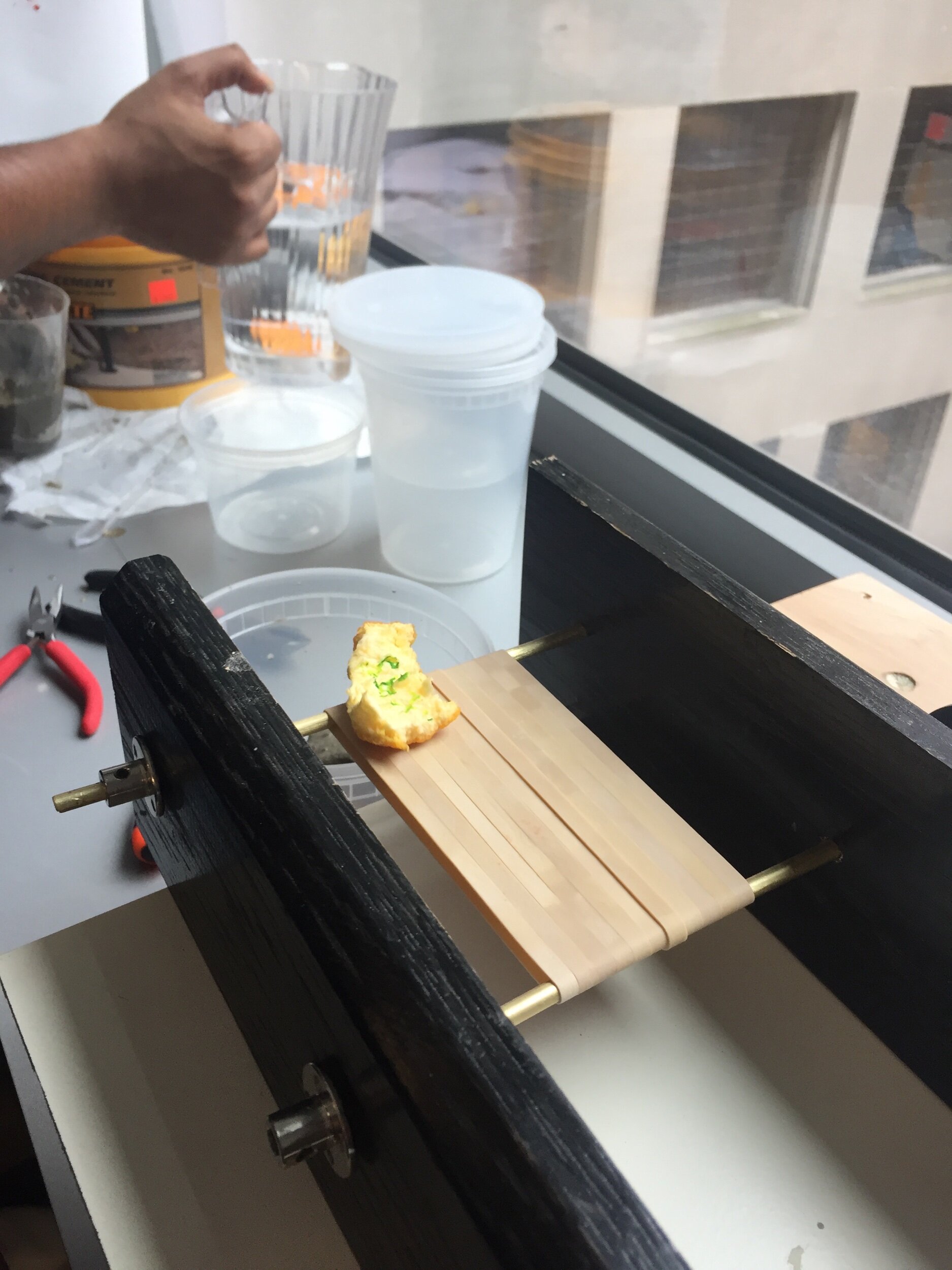
I then passed out pieces of orange peel and markers to my classmates and asked them to write at least one of their answers on those pieces. Then, they placed these pieces on a conveyor belt— the fabrication project— which dropped into a container. I poured layers of cement over the pieces of organic matter (I added some pieces of cheese and also passed out paper to write answers upon in addition to the orange peel.)

Some photos from the demo, then fabrication notes and reflections after the jump.

public.jpeg
public.jpeg
public.jpeg
public.jpeg

Fabrication: I cobbled together pieces from Brunos, Home Depot and (mostly) Jake and Noah — a million thanks to them! The conveyor belt used a motor with a 100 rpm gearbox, but 2000+ rpm motor — there was a lot of torque at the slow speed, which is useful for a conveyor belt. I built the frame and motor mount with scrap wood from the shop and wood screws to keep things in place. The belt itself was held together with some zinc-plated pipes and shaft couplers-like pieces to secure the pipes in place (this isn’t the right term; I’ll edit when I find the right one.) After testing with tape (taped to itself) and cardboard to no avail, I finally made the belt from a bunch of rubber bands. It actually proved to be quite effectively and looked nice to boot.

Improvements: I began this project the day before it was due, which was a nightmare. I knew what I wanted to build, but was waiting on parts for most of the week, and also just made the calculation that I needed to get other assignments done first and could get this one together in time for class. It led to a lot of running to the hardware store, a lot of shoddy craftsmanship, but ultimately a demo that I was happy with. I’d like to do this over again with better materials and more attention to the quality of fabrication; all of the screws should be flush, all of the holes for the zinc pipes big enough for good belt rotation, I should get the right sized pieces of wood (or something else the next time around) to make the whole setup more efficient.

For the demo, I’d like to experiment with different organic materials and different concrete molds. I may tweak the questions as well. Overall, I liked that my classmates seemed engaged and appreciated the opportunity for reflection; I think there’s a path to making this engaging for another audience.

The A-Minor Music Machine

So that this doesn’t get buried under the reflections below, here’s the sketch. I will update here when the version that works with Arduino is functional.

——

Within 10 minutes of posting this, I’ll probably be editing code again. This project, more than any up to this point, drove me insane and made me so happy.

At various points in the week, I grunted out loud to myself (and anyone in my general vicinity) as I failed to notice a missing “this.”; I enlisted a former software developer colleague to hop on the phone and talk me through questions late at night when office hours were no longer an option; I thought I’d reached a nice stopping place, then thought of one more feature, then looked up and another hour went by.

And in the process, my empathy for all the devs I know just increased exponentially from an already- empathetic place.

With the preamble aside— what was the assignment? What did I make?

The assignment this week was to use objects, classes, arrays of objects, and interactions between objects. I hadn’t yet used sound in a p5 sketch, so I made that a constraint for myself— do all of the above while using sound.

I got inspiration for this sketch from this example; after looking at it I wanted to see if I could replicate the effect on 4 different drum sounds on one canvas. I started by trying to get it working without any objects/classes, which you can see here. It worked! From there, I started to see a “sound” object coming together— something that had a type for each type of drum sound (kick, snare, etc). It would also be able to display itself and maybe analyze its amplitude. Simple, right?

The process of migrating this code to an object-oriented structure took a lot longer than I’d expected, and was the source of a lot of the grunting and requests for help. Ultimately, there were a couple of important lessons:

  • Understand variable scoping:

    • Global variables can be used.. um… globally.

      • When using something like p5.Amplitude this was a really important concept to internalize. p5.Amplitude measures the entire output audio unless otherwise specified. If p5.Amplitude is set globally, it’s not possible to setInput later on and have that used to, say, draw rectangle height like I do.

    • this.object is available for all object instances in the class

    • instantiating a variable inside a function within a class scopes that variable to just be available in the function

      • know when to use this vs a this.object

  • While debugging, isolate each action you are trying to perform independent of other actions.

    • Do this by finding or creating variables to console log in order to see whether the program in functioning as expected

  • Keep simplifying

    • I found myself, and still find myself, repeating some code with only small variations for particular cases. Instead of having a bunch of if statements to describe when to play a sound and the same set of if statements describe when to analyze a sound, maybe there could be a common variable that could pass to both .play and .analyze (in this case, this.sound.)

Pieces

I recorded the drum sounds, chords and bass notes in Logic Pro X and exported each sound as an mp3. I loaded those into p5 and used preLoad to make them available to the rest of the sketch.

I used the p5.Amplitude, setInput, and getLevel functions to get the amplitude of any given sound file. I could then pass that amplitude reading (done in the draw function to get it continuously as the file is played) to the rectangle height parameter to create the drum visualizations. Those are triggered by keystrokes.

The chords are stored in an array. The right and left arrows cycle either up or down the array, resetting if they reach the end of the array. When they are created, they get passed a random number between 1 and 6. That number is used to change the background. A few of the numbers change the background color. Others don’t. The number assigned to an instance of an object is random, so there’s no rhyme or reason to when the background changes other than that it only happens when chords are played.

There are some white dots that appear occasionally. These are an array of “Item” objects that get triggered from within the display function. These appear when a particular random number in the chord object appears when a kick drum has been played. In order to make this happen, I created a state variable to measure whether the kick drum has been played (but resets after it gets played). When the kick (and clap, same logic) has played and the random number coincided, these ellipses appear until the condition is no longer true.

The bass notes trigger the triangular visualization in a similar way.

All in all this has been a really rewarding project to really ramp up my understanding of a number of things. As an added bonus, it is a great foundation for working with serial communication in PComp: the variables controlled by keystrokes will be controlled by buttons and other things out in the real world!

Personal Branding

Assignment and Process

This week’s assignment was to develop a personal logo and style guide. Before settling on anything, I did a lot of doodling. I knew I wanted my initials, NK, to be the basis of the logo. They’re both very angular letters with triangles forming their shapes, which I ended up gravitating towards while doodling. I ended up coming back to one set of doodles over and over: I used only triangles to create the outlines of my initials in whitespace. I decided to go forward with this idea.

brainstorm.png

Logo Inspiration

One of my defining qualities is my adventurousness. I’m extremely curious and tend to go to great distances, both literally and figuratively, to learn new things. As a result, I’ve accumulated some seemingly disparate life experience; “seemingly” being the key word. In my mind, these pieces that looked different— whether industries and jobs, cultures and countries, or pieces of artwork across media— were really more similar than they appeared and fit into a coherent whole. The logo I landed on is made of triangles of mostly different sizes, book-ended by two triangles that appear to be snow-capped mountains. The whitespace between the triangles form my initials. Yet the logo almost asks to be turned, to be looked at different ways. Viewed in any orientation, it directs your eye towards another direction. I like it in black and white, with Sofia Pro Light type for any text.

type and color.png

nk logo sketch.png

ITP 8.png

After turning the image 90 degrees clockwise, the elements that make up the K are effective as a standalone logo. I could imagine this as an app icon. A lot of my qualities are expressed in this one image, even if my name is not. The small triangles framing the logo point in different directions, but always up — perhaps symbolizing my fundamentally optimistic approach to life. The mountain is framed here, putting my outdoors + adventurous qualities front and center. With color, the sunset or sunrise seems to emerge from behind the mountain; something that has been a source of inspiration in a number of works already this semester and in life in general.

ITP 3.png

ITP 6.png

Coconut Goblet of 🔥

This week’s assignment was to fasten at least two different materials together, not including plywood or acrylic.

As I brainstormed ideas early in the week, I kept returning to food. I want food-as-a-medium to be a central theme in a number of projects during my time at ITP. This time around, I was considering making something like a rack to hold mason jars full of fermentations. I was considering making something that made it easy to slide on cheesecloth over the neck openings in the early days of the fermentation, then easily replace the cloth with the regular mason jar lids, with the potential to put sensors and wires into the jars as well (something I’d like to do with PComp eventually.) So— this would be making something to hold something that treated food as a medium.

As I was working through design ideas, I quickly switched gears to go back to using food as a central medium in the piece itself. I decided to use a coconut shell — which I thought would have similar properties to a soft wood, but still present unique learning opportunities for this week’s assignment.

What could I do with the shell? With its natural curvature, it lends itself well to being a bowl or cup. Instead of going far afield, I decided to make a cup. I just broke one of mine, so I’m in the market for another :)

The main design constraint I gave myself here: I wanted to be able to unscrew/detach the coconut bowl from the stem for easy cleaning.

Behold: the Coconut Goblet of 🔥:

public.jpeg

So, did this meet the assignment criteria? Yep— this had a few different materials and fasteners:

  • Coconut to metal

    • I used the “tool of the week,” the tap and die, to thread a metal rod, which I used as the stem of the glass. The thread feeds into a hole in the base of the coconut, atop which I screwed on a 1/4-28 in threaded metal cap. It doesn’t fit perfectly snug, which thwarted my plan for the cap to close off the hole from any liquid.

  • Rope to metal

    • I wrapped the stem of the wineglass in rope, which I sealed with a knot on the bottom end and some hot glue on the top end. Shoutout to Noah for the rope and the hotglue idea, which he used in his project.

  • Coconut and metal to concrete

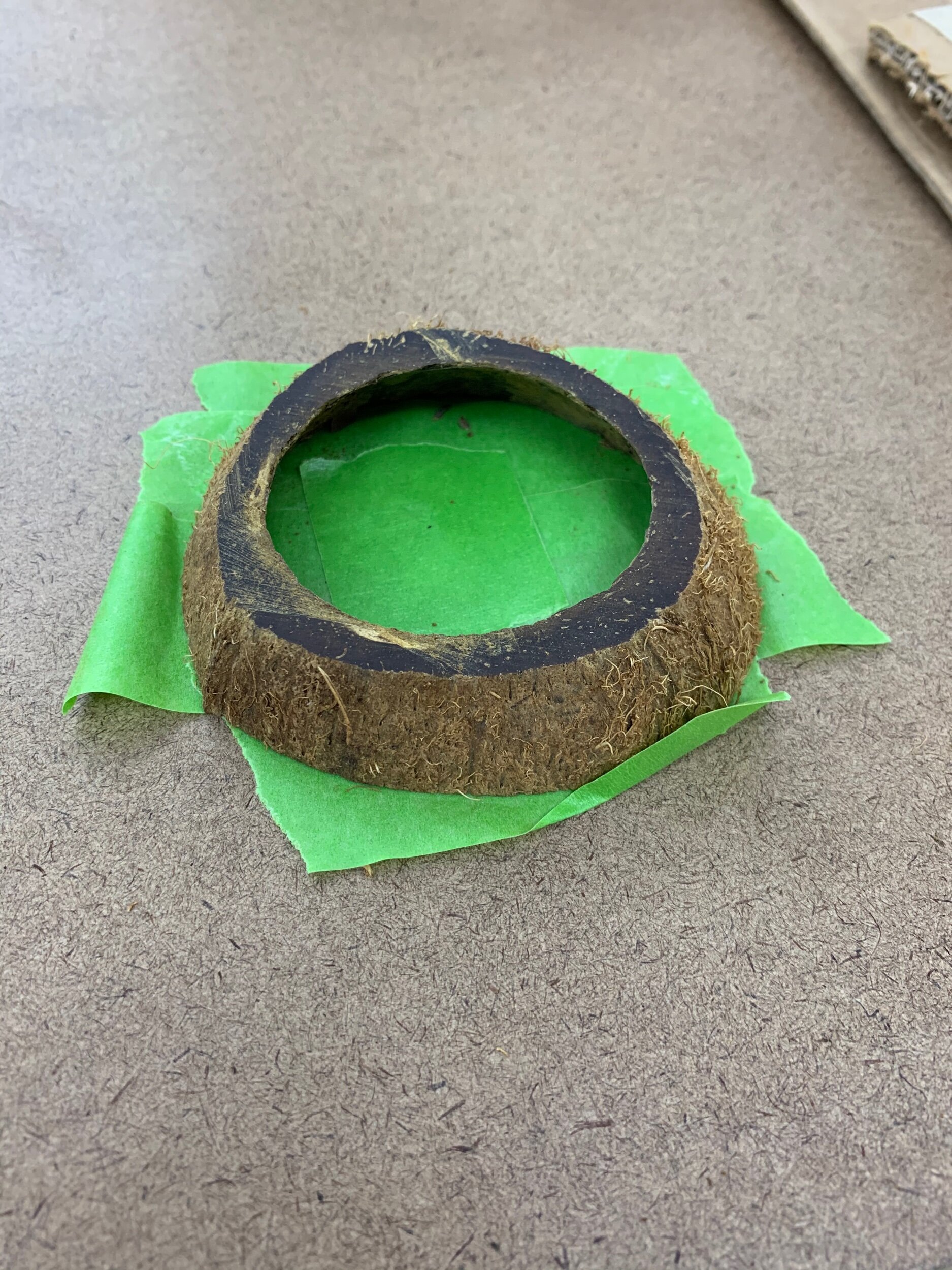
    • I used a sliced piece of the coconut shell for the base of the glass. I needed to seal off once side of the coconut in order to attach the stem; after considering using laser-cut acrylic, I decided to go a different route and pour in quick-mix concrete. Shoutout to Jake for the idea and pointers along the way.

    • The concrete took about 5 minutes to harden and fit the mold nicely without getting stuck to the tape that I used to keep everything contained inside the coconut. I used a helping-hand tool to keep the stem in place while the concrete set, and it came out straight.

Although I think this goblet is kinda fun, and something I could potentially bust out during a tiki-themed cocktail party, it isn’t quite functional yet. A bit of liquid still leaks through the hole in the coconut cup. I tried to seal off the bottom with hot glue; it’s an incremental improvement over nothing, but it doesn’t eliminate all leakage. A different kind of sealer might work better, but if I want to be able to unscrew the top of the glass for easy cleaning, I would need to avoid sealers that would keep the cup permanently attached to the stem.

I might be willing to bend on that design constraint just so I can drink a banana justino cocktail out of it.

Coconut base taped up and ready to receive concrete

Coconut base taped up and ready to receive concrete

Testing out how the quick concrete would set

Using the tap and die to create threading in metal rod

Finishing the coconut goblet with rope around the stem

PComp experiment to-be

I want to make a Midi controller with my Yeezy shoebox. I built the enclosure last week and just acquired the parts I need to try to get this to work. In conjunction with this week’s material covering serial communication, this seems like a good way to test my understanding.

The logic seems fairly straightforward:

I will connect the potentiometers to analog outputs and connect the buttons to digital outputs, which should send to a midi receiver that I’ll connect to the breadboard and midi port on the Arduino. I’ll write a program that both brings in the Midi library to the Arduino IDE and that sends midi out. I’ll need to convert the analog output to midi’s 0-127 range.

In the midi code, I think I’ll need to map the potentiometers and buttons to midi ports, which my digital audio workstation (Logic) will understand. I’m not sure this is necessary— it might be possible to do this mapping as long as Logic sees that midi is being sent.

I’ll be interested to see where there is more complexity than I anticipated. I’m sure there will be. I’ve found some tutorials online that should help, although I don’t know that any are exactly what I need!

EDIT: I just found this lab on the PComp website! I will follow along with it to see if it gets the job done with my Nano, even though I got an Uno and Midi socket based on the other tutorials I had seen.

Winter Show Poster Design

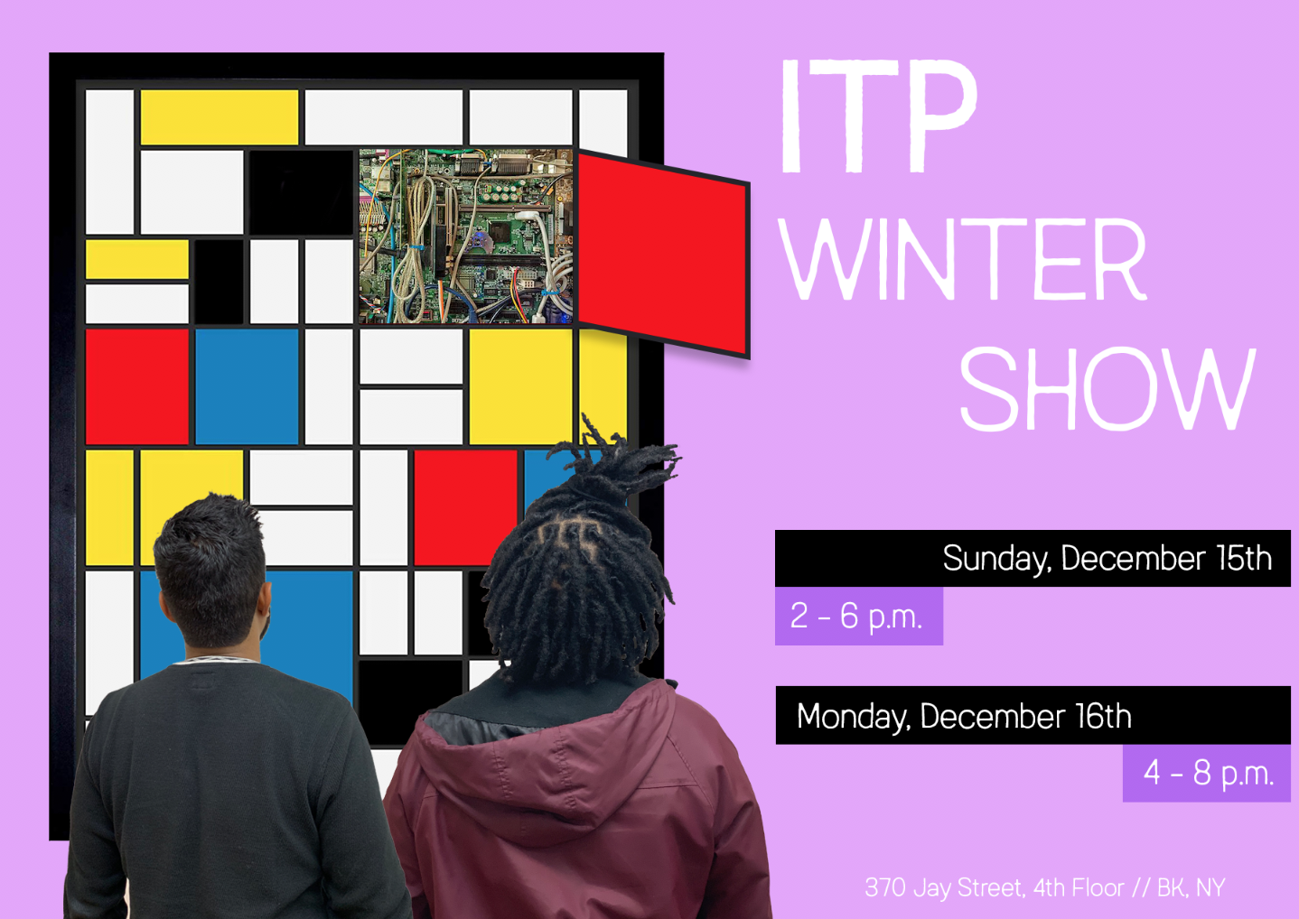
ITP is both an art and a technology program. It lives in the art school but has built a reputation for pushing the edge of creative technology. In my poster design for this semester’s Winter Show, I wanted to make sure that art was centered just as much as technology. In years past, posters have often highlighted emerging technologies like VR to get people curious about the show. I decided to highlight our connection to the art world with a reference to Mondrian— who helped push the art world towards a new, often uncomfortable, frontier of abstraction during his life.

winter show print.jpg

Process

At the outset of designing this poster, I knew I wanted to take a well known work of art and create a visual effect of exposing the insides, revealing a “technological” guts underneath. I had to choose a painting, then choose the specifics of what tech linkage to make. Mondrian made sense— those familiar with his life and work could see that his aspirations were in some ways analogous to ITP’s: to develop new tools for expression that stretched and challenged broadly accepted norms. Moreover, the panels on this painting serve nicely for “opening up.”

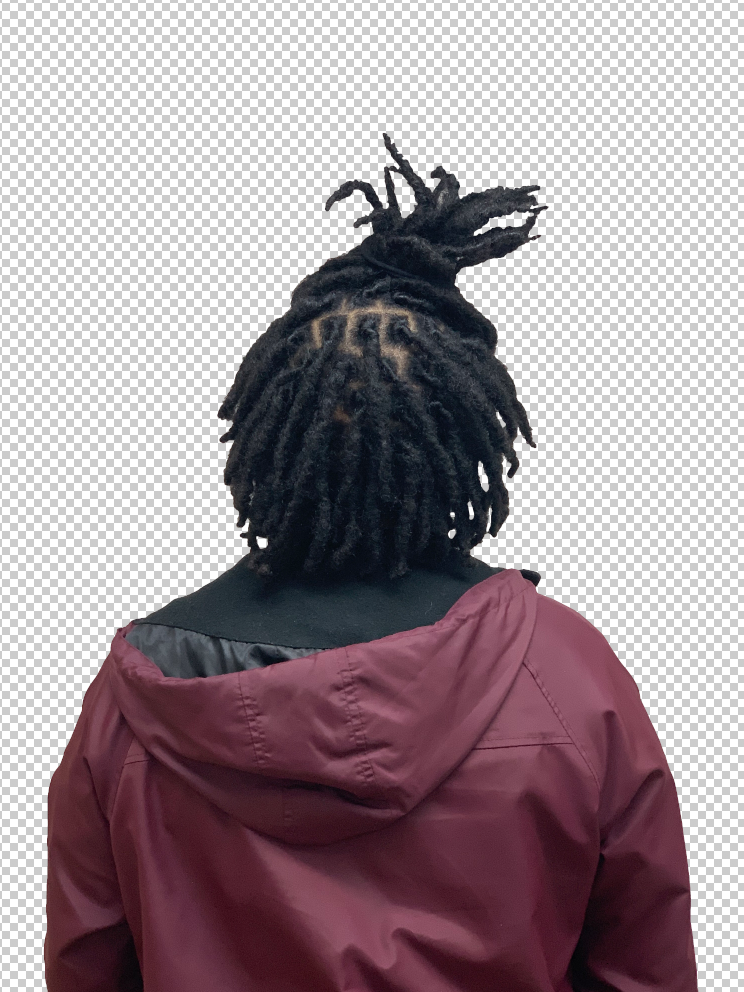
After landing on the concept, I quickly tested out whether it would look ok visually, especially since it was my first time using Photoshop seriously. I took a picture of my friend LeeLonn in the Motion Capture Lab space, then cropped out the background behind him (thanks Wen and Tina for the help!) Once I saw that it created a sense of depth and didn’t look too fake, I decided to add myself and then focus on the “tech” panel.

Screen Shot 2019-10-02 at 8.26.48 PM.png

I tried a few different items in the panel, but landed on just using wires/circuits in one panel. It got the concept across most simply, without any distraction or risk of a stray panel being poorly edited or hard to see.

Next, I chose a typeface (Austral) after searching around the web for a while for something that communicated both the modernity and warmth of the ITP community, then I considered background color. I first thought about pulling in colors from the poster, but in this case, too much similarity didn’t end up working. I tried a light purple and a light green as well— the light purple looked nice, but washed out some of the text elements on the poster.

Screen Shot 2019-10-02 at 8.13.12 PM.png
winter show.png

I also tested out a few different versions of the text blocks. Ultimately, I decided to go with the version at the top of the page because it created a symmetry with the Mondrian painting through its use of blocks and offset lines. The third element is bold in the version I chose and understated in the iteration above— I’m torn between the two, but I think the symmetry in the version I chose works better than the version above.

Finally, I also had a tough choice on margins. I chose to stretch the black margins all the way to the edge of the page to create a visual contrast to the margins elsewhere. To me, it looks intentional, but it teeters on the edge of looking sloppy. I’m not sure which is more effective between the poster I ultimately chose or the margins on this one below (disregard the collapsed purple tabs.)

Screen Shot 2019-10-02 at 11.27.12 PM.png

Yeezy Boost Midi Controller Enclosure

This past weekend the internet was abuzz as Kanye West held listening parties in New York, Detroit and Chicago for an upcoming album, meant to be released on Sunday but yet to be seen. For much of my life, Kanye’s music and approach to creative output has been inspiring — and as Yeezy Season approaches, I remembered that I had kept the box for a pair of shoes I purchased a year ago. Seems like an appropriate time to put it to use.

For this project, I decided to start building a MIDI Controller out of the shoebox. I’m going to be working on the wiring and Arduino programming this week to ensure the piece is functional. For now, I prototyped the buttons and knobs.

public.jpeg

When I work on the next set of steps, I know I’ll need to do a couple of things to ensure the knobs and buttons work properly, both electrically and vis-a-vis user experience: 1) place a firm platform underneath the buttons so that they click when pressed 2) Screw potentiometers through a second, thick piece of cardboard placed inside of the box to ensure the knobs turn properly.

I’ll likely create the platform mentioned above with acrylic in standoffs, creating housing for the circuit board and wires that will all live in the inner shoebox. I may need to further alter the inner shoe box to ensure that it doesn’t bump into mounted items when pulled out of the larger box.

Loops and Hoops

This week our ICM assignment focused on using loops to make our code express more with less. I also used the image and preLoad functions to bring in outside images, something I had not yet done. In the process, I got to start building a better intuition for how the different pieces of loops and if statements interact with each other, although I got a bit fixated on the images in my animation and have plenty left to explore about the nature of loops.

Take a look at the sketch here

The NBA season is fast approaching and Rockets fans (me included) are starting to get excited about the new James Harden and Russell Westbrook pairing. I made a silly animation/interaction to have some fun while playing around with loops and animation.

I used For Loops to generate a matrix of Draymond Green defenders on one side of the court while I used the same approach to if statements and incrementing that we used to bounce balls around the screen to animate James Harden and Russel Westbrook images. To add a little interactivity, I used the mousePressed function to both create a toggle state to create conditional “screens” after mouse clicks and to create a click counter, which let me make one screen only trigger after a certain number of clicks.

In the future, I’d like to see how I could have looped over an array of images to create a team of different players to be the defenders instead of 4 Draymonds. I also more than likely got lucky that this program worked— too many variables are named x and y inside of functions without intentionally thinking about variable scoping.

On to objects and functions!

10 Years of Waves

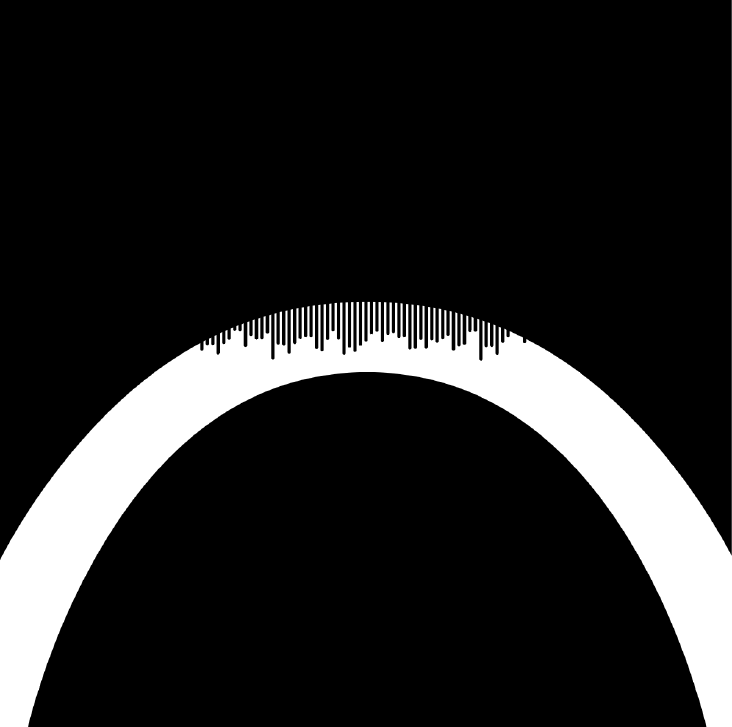
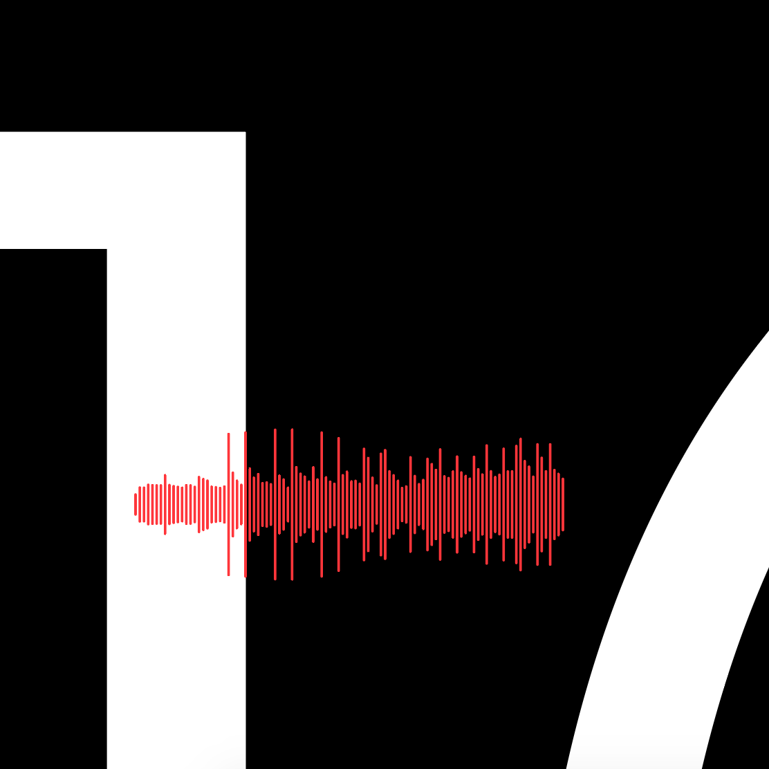
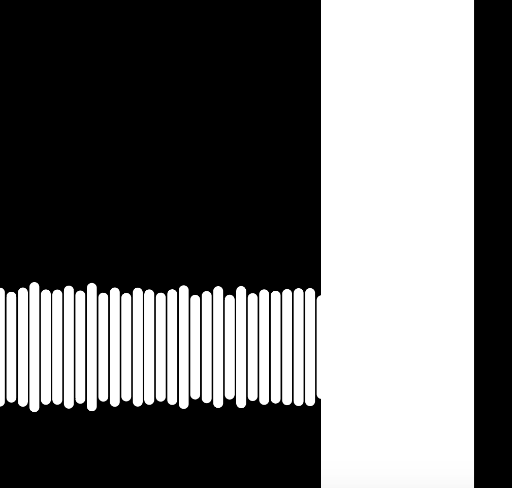
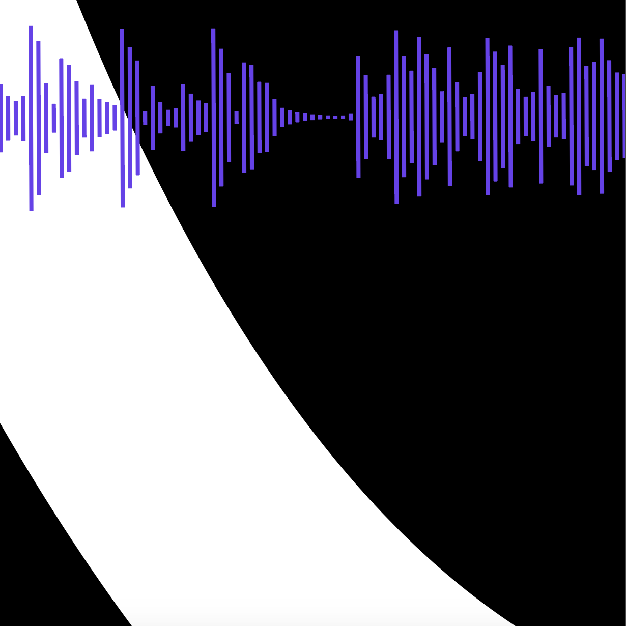
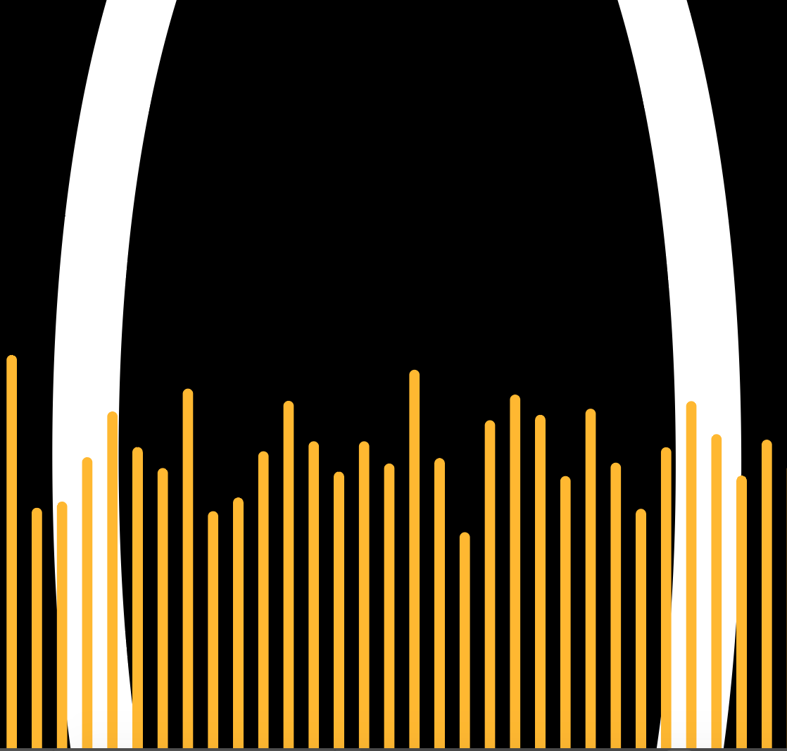
I recently found some music that I made in college, including the very first tracks I ever made. This academic year will mark 10 years since I graduated— it’s a good time to look back at who I was and who I’ve become. For this project, we were asked to use a color palette of 6 colors to represent ourselves and create compositions with just those colors. For the work below, I used the first 10 seconds of each of the 6 early songs that I found and visualized those as wave forms. I applied color to those waveforms and then placed them on a black canvas with white text of the number 10. I sized the waveforms differently and zoomed in close to the waveform to obscure the number 10 and create compositions that sometimes skewed each/any of the components of the image.

Below the gallery, I included the image of the full canvas. Note: when actually creating the compositions, I sometimes moved/deleted waveforms and the numbers, so what’s on this canvas now is not how it was set up for the compositions.

If you want to hear any of the tracks used for this piece (and maybe try to match the track to the composition), here is a private Soundcloud link.

10 master.png

Major Lazers

Some weeks don’t go as planned. This was one of them. Our assignment was to make something with the laser cutter— simple, right? Well, sometimes the unbounded constraints of a project like this end up becoming a noose for creativity; I let it become one this time around. I struggled to zero in on an idea and, instead of quickly prototyping the more ambitious ones, I worked on other assignments in the hope that something clearer would emerge over the week.

My Visual Language project centered around using waveforms as a visual element in a series of illustrations. Initially, I’d hoped to combine some of the conceptual underpinnings of that project with this laser cutting work. I considered creating a series of small laser-cut stencils of different waveforms that could be inserted into the top of a small box. The box would have holes drilled in the sides, through which I could insert dowels to hold and stretch a scroll of canvas. Pouring paint on the stencil would drip paint roughly in the shape of the waveform on the canvas underneath, and, ideally, turning one dowel would turn the canvas to paint on different canvas terrain.

I did not achieve this. I didn’t even get a chance to prototype the box. I did try to create a (bigger) stencil of a waveform along with an etched QR code to the song on Soundcloud, but the laser did not cut all the way through the waveform outlines and all of the places on the QR code that should have been black were etched white— which broke the QR code :(

Although this was a really disappointing result for the week, I learned a number of important lessons about the design process. The main one- I should have started converting my ideas, however ambitious, in to concrete, testable chunks as soon as possible.

public.jpeg